What Colors Make Periwinkle?
Curious about what colors make periwinkle? Stick around as we share the results…
Are you thinking of stepping outside the box and exploring a new hair color for the year? Or perhaps you are trying to capture the lovely bluish-purple flowers you see on your way to work?
Whatever you are endeavoring to achieve, learning how to make this periwinkle color should be at the top of your list.
Just the right combination and cross between lavender purple and light blue, periwinkle certainly is the stuff of dreams. This fairly-like and dreamy hue makes it perfect for individuals with a whimsical approach to life, fashion, and decorating.
Whether you are a hair colorist, a makeup artist, a fashion designer, or a painter, knowing what colors make periwinkle is undoubtedly essential.
Read on to learn more…
What Color is Periwinkle?
All this talk of periwinkle might have you wondering, “what in the world is this color?”
In a nutshell, this pastel hue is a mix of lavender purple and light blue.
In many cases, its outcome may greatly depend on the lightness and darkness of its parent colors, tethering it between blue and violet.
At times, this shade is also called a pastel tint of indigo because it is not exactly indigo and it takes on a lavender purplish tone.
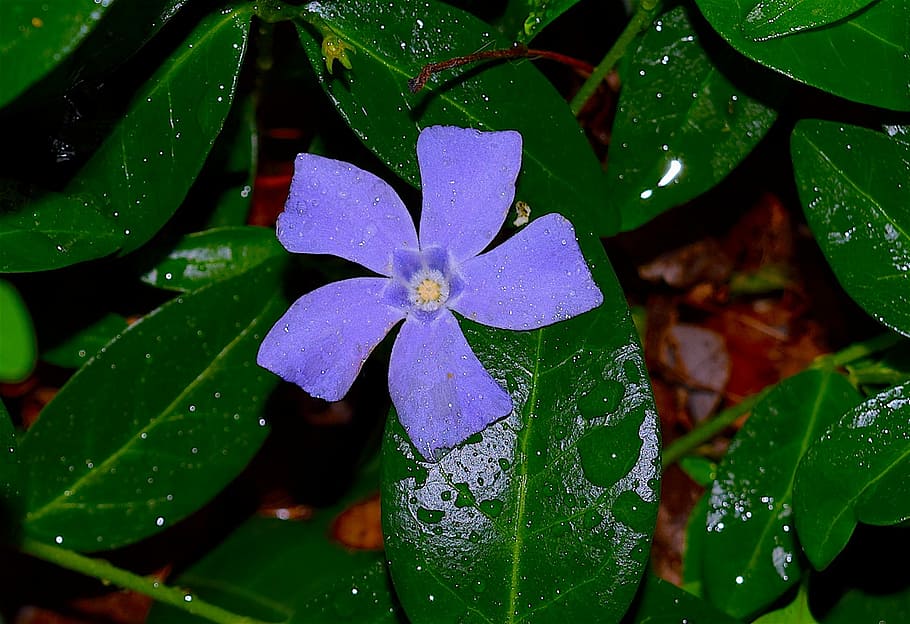
Named after the periwinkle flower, it is both striking and sharp as well as cool and muted all at the same time.
The Fundamentals of Color Mixing
Now that you are aware of the tones present in this particular hue, you may be itching to try color mixing for yourself.
However, before jumping into color mixing and trying your hand at recreating this shade, it’s important to familiarize yourself with the basics of color mixing: the color theory and the color wheel.
Though you can easily grab two or more pigments to experiment with, the outcome may not necessarily be the same when you do not have a solid grasp of the color wheel and color theory.
Aptly named, the color wheel refers to a spectrum of hues carefully mapped out into a circle. In essence, the color wheel is responsible for showing the harmony between two or more tones and showing the relationship of pigments to one another.
On the other hand, color theory grounds itself on the color wheel. This anchorage of sorts in color theory allows individuals to see what shades look good together.
A closer look at the color wheel shows you that each hue on the color spectrum tends to fall within three main categories, namely the primary, secondary, and tertiary colors.
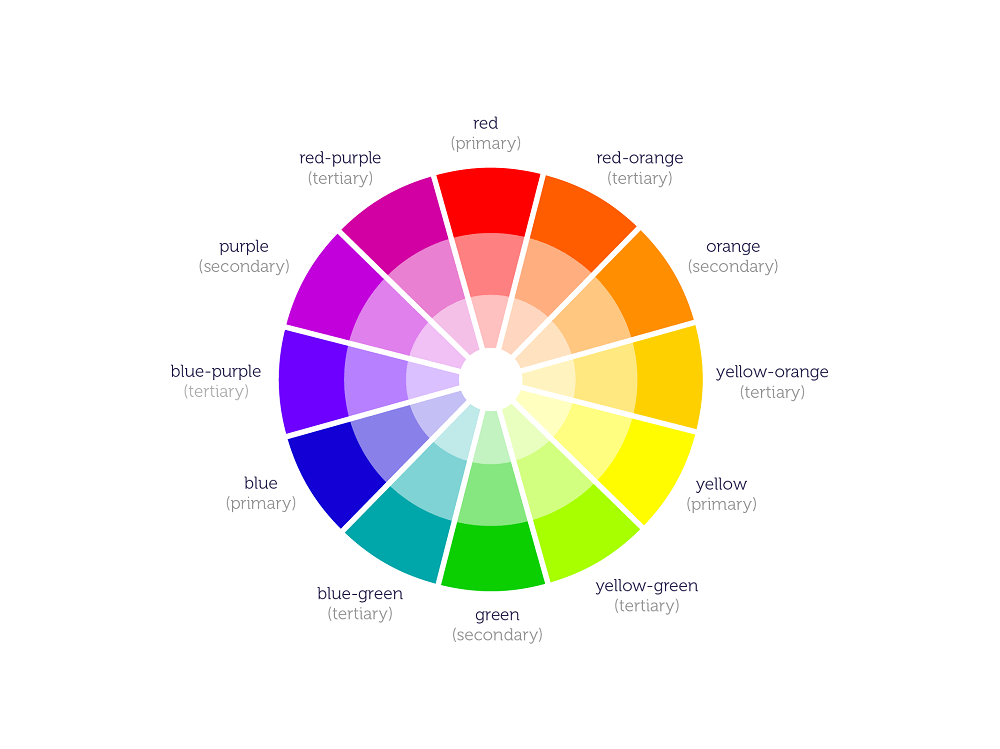 Primary colors refer to red, yellow, and blue. These are called primary tones because they serve as the foundation and overarching hues found in the secondary and tertiary color groups.
Secondary tones, on the other hand, refer to shades that come to life when two primary hues are mixed. These are orange, violet, and green.
Meanwhile, tertiary hues result when one primary pigment and one secondary pigment are combined. These are blue-green, blue-violet, red-orange, red-violet, yellow-orange, and yellow-green.
What Colors Make Periwinkle
Now that you have the basics down to a tee, you might have an idea as to what colors make periwinkle.
How do you make the color periwinkle?
As stated above, this hue falls between lavender purple and light blue.
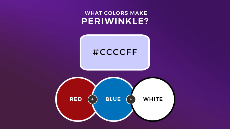
From this, you can deduce that the main colors you need are red and blue.
Red and blue make violet. Adding white can help lighten and soften this otherwise dark hue down to a pastel tone.
However, you may also start by mixing red and white together to create pink, then adding blue to soften the tones from the start.
For a lighter blue shade, you may simply add hints of white to your classic blue color. Combine this with the pinkish, purplish hue and you can easily achieve the elusive and magical periwinkle.
To darken the pigment, you only need to add more violet to the mix. You may also opt for a gray tone for darkening purposes as this will give depth and dimension. Start by adding small amounts to avoid going overboard.
Periwinkle in Design
A true pastel hue, periwinkle represents calmness and serenity. It also evokes a sense of peace and sentimentality and symbolizes friendship and love that grows fruitful through time.
To channel this into your space and just about any room, use periwinkle on your walls for a striking yet neutral-leaning accent piece.
Offset this by pairing it with oranges and greens and perhaps a spring-toned and rustic approach to your space. You may also use this shade with neutrals such as white and cream, as well as other shades of blue and violet for some complementary action.
In making a fashion-forward statement, you may embrace this as a hair color. This will give you an edgy yet youthful look. Feel free to dress this up or down with a leather jacket or even a sleek blazer.
The Bottom Line
With this guide, you can now achieve your very own periwinkle creation in no time. This relaxing and calming hue is designed to give your place (or your artwork) the extra touch of whimsy and fantasy it needs. Hope you enjoyed our article about what colors make periwinkle. Cheers!

Read Latest Posts


Hi, I'm Anthony Tran! Welcome to my site. I live in Arizona and am obsessed with all things related to building an Online Business and working from home. Learn about my journey here.
Follow Online