Red and Pink Mixed! What Color Do Red and Pink Make?
Are you curious about what color does red and pink make when mixed together? Stick around as we share with you the answer to your question.
Keep reading…
Anyone who works with colorful mediums knows how important it is to experiment with their materials: For painters, use your paint and canvas to portray subjects you have never painted before.
Make-up artists can try experimenting with their palettes to create enchanting looks.
When it comes to experimenting, another exciting way to widen your horizons is to explore the results of mixing colors. This is guaranteed to help expand your palette, which can offer a world of possibilities for any artist.
Before we dive in let’s talk about color theory and how mixing colors work.
Ready? Let’s dive in…
Understanding the Color Wheel
The best way to answer this is to discuss the most basic aspects of color combination: primary, secondary, and tertiary hues. These three groups make up what we know as the color wheel.
Primary colors are also known as basics. This is because they are the base of the second group, which is the secondary hues. According to this simple color theory, you cannot create a primary hue by mixing others. The three primaries are red, blue, and yellow.
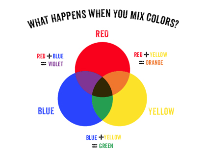
Now, when it comes to secondaries, the most important thing to know is that they are formed by combining two primaries.
When you mix red with yellow, you will get orange, but if you use blue instead of yellow, then the resulting hue is violet or purple. You can form green by mixing blue and yellow.
Tertiary colors are those that are formed by blending one primary and one secondary hue. The results of this combination are also referred to as intermediary hues.
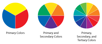
Lining them up in a circle according to their relationships with each other forms the color wheel.
Knowing your primaries, secondaries, and tertiaries allows you to understand the most basic permutations of hues.
To continue our discussion, let us proceed to tints, shades, and tones. Keep reading…
Tints, Tones, Shades, and Hues
After reviewing how some of the most fundamental hues are formed, you are ready to learn the elements that make up a gradient. These are hues, tints, shades, and tones.
Tints are formed when you add white with pure color. These are is often referred to as pastels and they are known for being light and pale. I
n this discussion, it is important to know that pink is a tint, which is achieved when you mix white with red.
Tones are created when you mix grey with pure color. This results in a pastel-like color but with a more neutralized quality.
These often appear dull and are always darker than tints. When you mix gray with red, you can get a variety of results depending on how dark your gray is. This can range from a chalky reddish color to an ashy kind of pink.
Shades are formed when you use black to darken a pure color. These are the darkest version of the color. For red, adding black creates a muddy, blackish-red variation.
You might be wondering what exactly a hue is. Hues are the dominant color family of the gradient you are looking at, the pure color. In our examples above, the hue is red, which is the pure color we used to create tints, tones, and shades.
Now that you know that pink is a tint of red, you are ready to find out what you get by combining the two. Read on…
What Color Do Red and Pink Make?
The answer to this is raspberry pink. Remember that as a tint, pink is a lightened and pastel version of red. So, when you add more of the hue to the mixture, you will create a brighter and more striking version, reminiscent of the taste and appearance of raspberries.
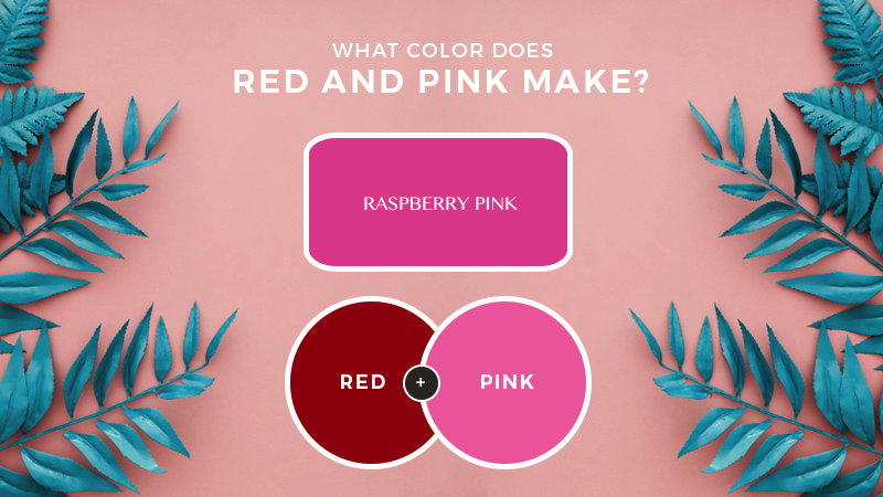
The best thing about this combination is you can create a livelier variety by adding more of the hue, or you can create a lighter and more muted tint by adding pink.
This can help create a monotone palette.
Conclusion
Experimenting with colors, especially pink and red can open up a world of possibilities for any artist or designer. You can use raspberry pink in your work by placing it beside its complementaries, including versions of green, especially mint.
This can create a “bubblegum” design. In the hands of a skilled artist or designer, these two colors can pave the way toward classy and trendy work.
Aside from combining the two in your work, you can also use them separately, albeit alongside each other. In interior design, you can use the two to highlight aspects of the room.
By using the deeper hue’s sharpness to emphasize various elements, you can rest assured that your work will have more depth and dynamics.

Read Latest Posts


Hi, I'm Anthony Tran! Welcome to my site. I live in Arizona and am obsessed with all things related to building an Online Business and working from home. Learn about my journey here.
Follow Online