What Two Colors Make Pink? How to Make Pink Color
In this article, we’re going to answer how to make pink color and also “what two colors make pink?”
Rosy cheeks. A ballerina. Frosting on a doughnut. What do these items have in common? Most likely they are a brilliant shade of pink.
In modern society, the color pink is both ubiquitous and powerful. However, there are a lot of preconceived notions about pink, namely how feminine it seems.
Today, however, we’re going to do a deep dive into this soft and elegant color, showing you what two colors make pink, how to make pink, and how you can utilize it in your life.
Whether you’re a painter, graphic designer, artist, interior decorator, or even a cook trying to make food coloring, the color pink is much more versatile and poignant than you may think. If you believe that it’s just a “girly color,” then you are sorely mistaken.
So, join us in our quest to understand what makes pink such a powerful tool for artists and designers.
Color Theory: Pink
Before we can understand anything about a particular color, we should first look at how color exists in the first place. The world is a tapestry of different shades and hues, and they can shape a lot of our perceptions of our environments.
Typically, all colors are aligned on what’s called the color wheel. This shape is crucial because it enables you to see how these hues interact with each other.
Colors that sit on opposing sides of the wheel are complementary. This means that they clash fundamentally, which commands our attention. Examples of complementary colors include red and green or purple and yellow.
Conversely, hues that sit next to each other along the wheel are considered analogous. This means that they go together in a much more subtle way since they are similar in both shade and meaning.
Warm vs. Cool Colors
Another core component of color theory relates to how each shade makes us feel. Warm colors include fiery options like red, orange, and yellow. Cool colors, by comparison, are calming tones like purple, blue, and green.
Since red is one of the base colors for pink, it would be considered a warm tone. This is vital to understanding how it can be utilized effectively in design.
Since warm colors remind us of heat and emotion, they can create a powerful message when sufficiently explored.
Pink in Design
As we mentioned, this color is everywhere. It seems like you can’t go into a store or browse the web without seeing some form of pink.
This is because the hue is such a dynamic shade that comes with a lot of emotions and perceptions. Simply put, adding a bold shade of pink can make a grand statement without having to put anything else.
So, with that in mind, let’s see how this color is utilized in the design and how it can influence your next art piece or decor idea.
What Does Pink Represent?
We know that warm colors are more emotional and passionate than cool shades, but what about pink specifically? What feelings does it conjure up when we see it on a wall or in an advertisement?
Since pink is thought of as a feminine color, it is usually associated with love, compassion, and relationships. A red rose means that your passion burns brightly, but a pink one will imply that your feelings are a bit softer, and more tender.
Thus, we can increase the level of emotion in the color pink by shading it differently. If the red side pops out more, then it will elicit a passionate response.
More white, on the other hand, makes the color seem brighter and softer, which evokes a more soothing reaction.
Pink is Calming and Nurturing
Overall, this color is associated with positivity and hope. You can’t see pink without thinking happy thoughts, which makes it such a powerful tool to wield.
It can calm us when we are feeling angry or passionate, and it can inspire us when we’re feeling dark and gloomy.
In design, this can be utilized for a variety of purposes. Let’s look at the most common ways that pink shows up in our daily lives.
- Love and Romance: although red inspires a more passionate response, pink is still heavily involved in relationships. It’s a symbol of lasting love and respect for one another, and it’s a sign that you’re moving toward a brighter, more positive future.
- Childhood Innocence: is there anything cuter than a little girl dressing up as a ballerina or a princess? Pink is strongly associated with youth (mostly girls), so it can harken back
to a simpler time. Seeing this color stirs up a bit of nostalgia for us, which can create a broad range of positive feelings. - Care and Compassion: there’s a reason that pink is the official color of breast cancer. Not only does it inspire a more feminine reaction, but it encourages a nurturing one as well.
- Sweetness: finally, many candy and confectionary companies utilize pink to elicit a better reaction to their goods. Donuts out of a pink box just taste better, as do candies that are either colored pink or have pink packaging.
What Two Colors Make Pink
As you can see, there is a lot to unpack with this color, which is why it can be so dynamic and influential. As such, learning how to make it will ensure that you can wield its power effectively.
Now that we have a good foundation for the color pink let’s answer the simple question, “What two colors make pink?”
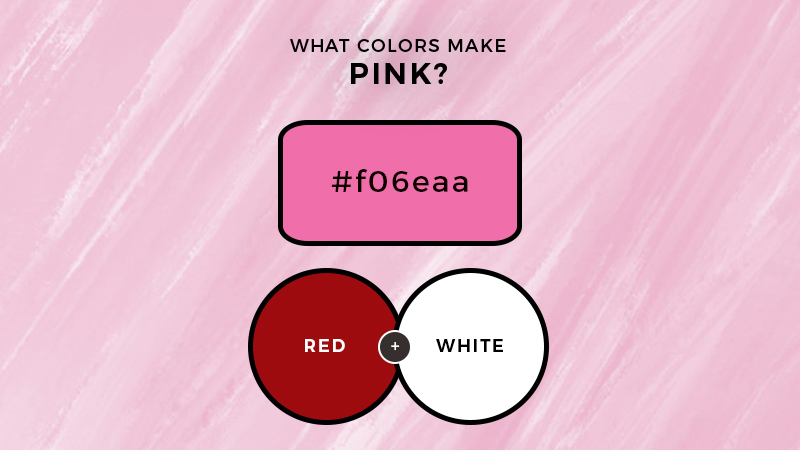
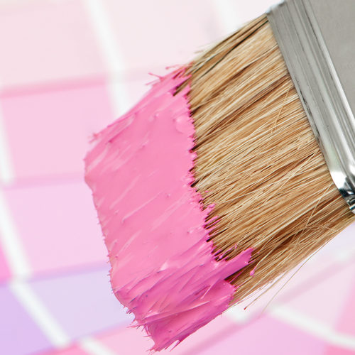
For the most part, pink is a combination of two colors: red and white.
When you mix the two colors red and white you get pink =)
However, there are several different variations of pink that can have different connotations based on how much color is involved.
For example, hot pink elicits a much stronger reaction than a lighter shade of this hue. However, hot pink is not a result of just adding more red or more white.
Instead, you have to mix in a variety of colors to get the right shade. So if you’re wondering how to make hot pink watercolor, try adding more red to your palette.
Otherwise, you can try this…
Purple, blue, and green in varying amounts can turn your pink into more of a fuchsia, which is another term for “hot pink.”
By mixing and matching these shades, you can create a much bolder and brighter variation of pink, which can have a much more profound effect on your piece.
Overall, the deeper the shade, the more passionate and inspiring it will be. On the opposite end, lightening it with extra white will make it seem softer and calmer.
So, to put it in perspective, if you want to inspire action from your viewers, then choose a deep pink. Alternatively, if you want to relax them and help them feel warm and comfortable, make it lighter.
How to Make Pink Color Video
Colors That Go With Pink
One thing to remember is that color doesn’t happen in a vacuum. By this, we mean that the area surrounding the hue matters just as much as it does.
Even negative space (such as a white or black wall) can create a much stronger reaction.
As such, it’s imperative that you realize how different colors can affect pink. This is a powerful lesson for both designers and artists because it will enable you to enhance your work even further.
Thus, let’s take a look at which colors will work the best with pink. We’ll also look at how they interact with each other to produce an overarching theme or emotion.
Playful Colors: Pink with Red or Orange
Since these are all analogous colors, putting them together will enhance your piece without becoming overwhelming.
On the one side, you can go deep with hot pink and bright red. This will create a vibrant and exciting matchup that can seem both playful and glamorous.
On the other side, you can lighten things up by choosing brighter shades or going with yellow instead. The effect will still be fun and exciting but in a more calming way.
Contrasting Colors: Black and Other Dark Shades
Since pink is naturally a brighter shade, pairing it with something dark will create a bold and interesting look. For the most part, darker colors recede while lighter ones move forward, so use that to your advantage.
For example, a pink background with a black border will make the surface look bigger like it’s coming out of the frame. The opposite will create the illusion that the center is pulling away from the viewer.
Neutral Colors: Gray and Light Brown
Finally, if you want to create a more elegant palette that doesn’t command too much attention, choose mild to light grays and browns. They blend well with pink and create an aesthetic that seems both modern and vintage.
Overall, if you’re going for neutral, keep the pink color lighter and softer. Hot pink mixed with light gray might clash, and not in a good way.
Bottom Line
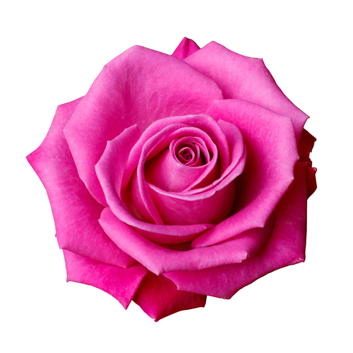
When looking at what colors make pink, there is so much that you can do. Think about where you see pink in nature and let it inspire you. Whether it’s a flock of flamingos or a cherry blossom tree, pink can be as versatile and dynamic as you want it to be.
So the next time you’re trying to figure out what two colors make pink, just remember that Red and White are your best combinations to get this desired color.

Read Latest Posts


Hi, I'm Anthony Tran! Welcome to my site. I live in Arizona and am obsessed with all things related to building an Online Business and working from home. Learn about my journey here.
Follow Online