What Two Colors Make Gold? How to Make Gold Paint
In this article, we are going to answer the questions “What Two Colors Make Gold? and How to Make Gold Paint?”
This can help you if you’re trying to mix acrylic paint, watercolors, regular paint, crayons, or even colored pencils.
Let’s explore further…
When you think of fabulous riches and immense wealth, what color comes to mind? If you’re like most people, then you probably imagined gold.
This rare substance is both highly valuable and well regarded, no matter what part of the globe you’re from.
Gold is the color of opulence and class, which is why it’s such a desirable hue. Today we’re going to dive deep into gold. We’re going to look at what colors make gold and how they can be utilized effectively in design.
Although not everyone can afford the real thing, mastering the gold color can provide the illusion of wealth and success. So, with that in mind, let’s start mining for the deeper meaning behind this illustrious color.
Color Theory: Gold
When looking at different hues, it’s imperative that we understand how they exist in relation to other colors. Color theory is the study of these interactions, as well as how to mix different colors to produce a wide variety of results.
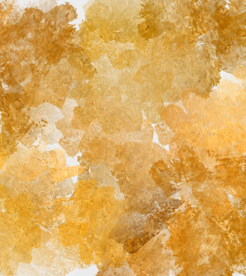
Gold sits somewhere between yellow and orange on the color spectrum. The brighter it is, the more yellow it is.
However, if it’s somewhat dull, then it can appear a bit more orange. Although brown is one of the base colors, it doesn’t sit on that side of the color wheel.
Warm Colors
Hues like red, orange, and yellow are considered “warm.” Since they are most akin to fire, they can create energy and excitement when combined.
Colors that sit together on the color wheel are called analogous, so gold would be considered comparable to these warm hues.
Cool Colors
On the opposite side of the wheel, we have green, blue, and purple. These are complementary to the warm colors, which means that they create a vibrant clash that attracts our attention.
Yellow and purple are perfect examples of complementary colors, but gold would work in yellow’s place.
Psychology of Gold

As we mentioned, gold reminds us of the mineral from which it gets its name. As such, we associate it with power and wealth. A side effect of that is that gold also represents order and stability. It commands respect.
So, when using gold in art or design, it’s crucial that you understand the feelings and emotions that are behind it. As a warm color, it can add some energy to your piece, but since it’s also highly regarded, it provides some elegance and weight to it as well.
Overall, if you’re trying to add some prestige to your artwork, then a splash of gold will go a long way.
Gold in Design
Unlike most other colors, gold is not always good in large quantities. Since the color itself screams privilege and opulence, having too much of it can easily overwhelm any other hues that you may employ.
Regardless, there are some ways that you can have an abundance of gold without it becoming too gaudy.
Keep it Neutral
When using gold as a base color, rather than an accent, you don’t want it to be too bright and shiny. Instead, use more brown and gray to tone it down a little bit.
You may still want some highlights here and there, but don’t go overboard.
Gold as an Accent
Typically, gold should be employed as a means of drawing attention. As a focal point, it works well because it naturally attracts our eyes, especially when it shines brilliantly.
Metallic gold paints are perfect for accentuating a part of your piece, but less is always more.
As a rule, you want the gold to be shiny if it’s a representation of something (i.e., jewelry, a gold star, or a trophy).
If it isn’t, then try to make it metallic without being too flashy.
Physical vs. Digital Space
Regardless of the color you use, it’s essential that you understand the difference between colors that exist in the real world (i.e., paint) and those that only exist on the computer. Since digital screens are backlit, colors show much more vibrancy than they would normally. Simply put, you’re adding a bunch of white to the hue, so keep that in mind.
Since gold can be vastly affected by brightness, it’s imperative that you know how it will appear in both mediums. As paint, it will start to fade as it dries. However, on the computer screen, it will always have the same brilliance.
What Two Colors Make Gold
As we’ve mentioned, the color gold sits on the warmer side of the color wheel. However, one of the core elements is brown, which is considered a more neutral hue.
But, what two colors make gold? Simply in regards to how to make gold paint, you have to mix both yellow and brown.
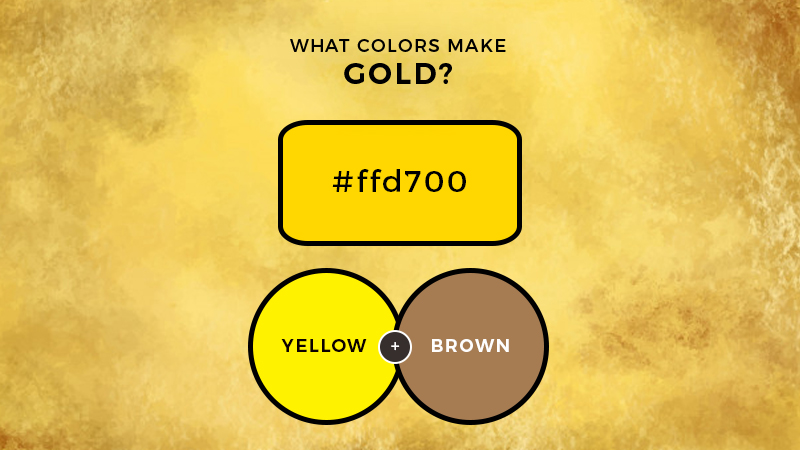
When you mix the two colors yellow and brown you get a gold color.
At its most elemental, gold can be created with just these two colors.
However, that will only result in an approximation of the hue. Usually, you want it to be a representation of the real thing, which means that you have to mix and match other colors as well to get the right brilliance and shine.
Adding more yellow will make the gold vibrant, but you also have to add a little bit of white paint as well. This will enhance the aesthetic and allow your gold to leap off of the canvas (or the wall).
As with most colors, remember that white is a powerful additive, so add it in incremental amounts until you get the look that you want.
If you want your gold to seem more metallic and three-dimensional, then you have to add a little bit of orange with the brown. This will make it look more realistic without dampening the overall shade.
How to Make Gold Paint Color Video
Colors that Go With Gold
When figuring out how to employ gold in your next project, it’s helpful to know what colors it can be combined with to create a balanced aesthetic. Remember, too much gold can come across as tacky or gaudy, so it’s better to offset it with some other, more muted tones to create a better balance.
Complementary Colors
Since gold is considered a warm shade, you can combine it with cooler colors to create more of a dynamic result. Purple and blue are going to be your best option, although purple is by far the most complementary.
When utilizing warm and cold colors in the design, you want to remember that darker hues recede while lighter ones come forward.
This means that if you place a dark purple border around a gold space, it will accentuate the lighter shade and make it seem as if it’s leaping from the canvas or wall.
Conversely, a golden border with a dark purple or blue centerpiece will make it appear as if it’s sinking into the background, like a void.
Analogous Colors
Red and orange mixed with splashes of gold can be both exciting and vibrant. They will add more energy to your piece, so it’s crucial that you use them smartly. Too many warm colors coupled together can be overwhelming, and the gold may not be as visible in that case.
As such, if you want to use warm hues with your gold, then make sure that they are more neutral. Bright red with a gold accent will kind of blend into each other, and you will lose a lot of the brilliance that comes from the gold.
Conversely, muted shade of red will help the gold shine brighter.
For the most part, don’t combine gold with yellow. Usually, they will just mix together, and it will be nearly impossible to tell the two apart. However, if you go with a darker, richer shade of gold, it could work.
Neutral Colors
Gray and brown are another fantastic option when mixing gold. Black can also work well since it will make the gold pop that much more. If you are going to use black as a background or a border, be sure that your gold is bright and shiny. If it’s metallic and muted, then it will only look worse when paired with black.
When using gold and gray, keep them both relatively neutral. Brown works best with a lighter shade of gold, as it can start to blend with a deeper version.
Detail Work
One other possibility when using gold as decoration or art is to create a unique design with it. Since the color is already associated with opulence, it works perfectly with intricate shapes and patterns that accentuate your base colors.
One option is to use gold as an ornate border around the wall, or you can have it as a centerpiece design that draws the eye.
If you are going to go this route, make sure that your pattern is highly detailed and elegant. This will ensure that the golden sheen will enhance the piece and add prestige to it.
Conclusion
When compared to other colors, gold is remarkable in its own right. When learning how to make gold paint, you will want to experiment by adding more or less one of the base colors. Also, be sure to see how white interacts with them to add a bright sheen to the hue.
No matter what, remember that gold is best used in moderation. However, if you’re going to make it a central point of your piece, then make sure that it’s muted and neutral to avoid overwhelming your audience.
In conclusion, the next time someone asks you the question what two colors make gold? You can simply reply with brown and yellow.

Read Latest Posts


Hi, I'm Anthony Tran! Welcome to my site. I live in Arizona and am obsessed with all things related to building an Online Business and working from home. Learn about my journey here.
Follow Online