Red and White Mixed! What Color Do Red and White Make?
Are you wondering what will happen if you mix red and white paint?
When you imagine combining these two colors, you likely realize that white lightens the color red which in turn becomes less warm.
Today, we are going to take a closer look at what happens when we mix white and red. Additionally, we are going to discuss how colors interact with one another and find out the result of the color combination.
Keep reading…
Colors are important visual elements that affect a person’s mood, feelings, emotions, and state of mind. Can you picture a world without colors?
Everything would look dull and devoid of life; thus, colors truly play an important role in society.
Flashy and vibrant colors can make things exciting for people, while neutral colors can provide a sense of style, fashion, and way of life that some people enjoy.
The colors red and white are both integral colors. Red, for instance, is a primary color, which helps create other colors. When mixed with other hues you can get secondary and tertiary colors using red as a base.
Basics of Color Theory
For us to get a full background on what color can be created when red and white are mixed, we should first look at how colors operate.
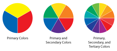
The entire spectrum of hues can be found on the color wheel—an illustrative organization of colors that shows the relationships of hues.
The diagram below shows that red, a warm color, is placed side-by-side with colors such as orange, yellow, pink, and maroon. Meanwhile, white can be found at the center of the color wheel, together with gray, indicating the mixture of distinct wavelengths of light.
Since we are talking about red and white, let us look closely at their role in the color wheel and the existence of newly formed colors.
Warm and Cool Colors
Generally, warm colors are those which evoke warmth, colors that represent the sun or fire. Red is obviously a warm color.
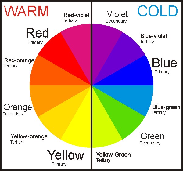
White is neither warm nor cool; it is neutral.
In science, white contains all wavelengths of visible light. But in art, white is the absence of color, a pigment that depicts a harmony of silence, much like gray and black.
Knowing the difference between warm, cool, and neutral colors gives you an idea of what will happen if you mix these pigments. In the case of white and red, you can imagine how red will be affected by the color white.
Understanding Color Mixture
Colors are created by mixing or combining two or more hues. The primary colors red, blue, and yellow can be mixed together to form secondary colors.
Then, if you mix primary and secondary hues, you can get tertiary colors red-orange, yellow-orange, yellow-green, blue-green, blue-violet, and red-violet.
You can also mix neutral colors to create more color variations within the same family. By adding white, you are making colors lighter than normal, and adding black can make these pigments darker than usual.
In interior design jargon, these are known as tints, shades, and tones.
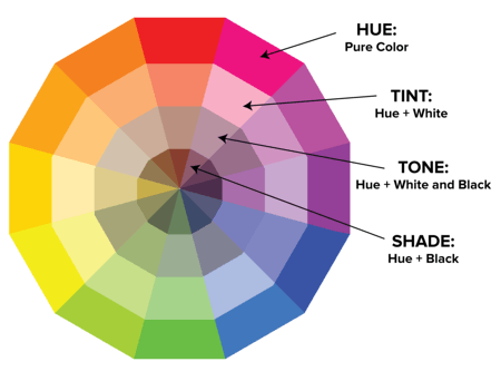
- Tint: Adding white to make the color lighter.
- Shade: Act of darkening a color by adding black.
- Tone: Making colors slightly darker using gray.
As an artist, it is part of your duties to find out the exact shades, tints, and tones of colors you want to use in a specific work of art. By experimenting with color mixing, you can eventually come up with the perfect colors to use for aesthetic purposes.
What Color Does Red and White Make
Now that we have a good background and foundation on the color theory, we can move on to what color red and white make.
Simply put…
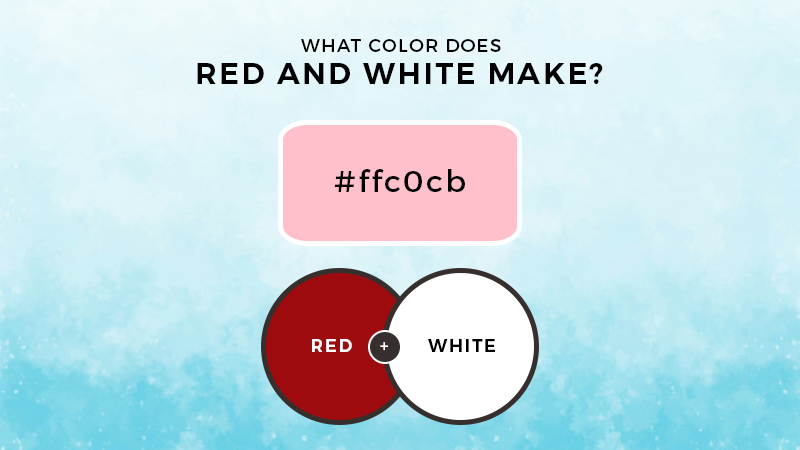
The answer is pink.
Get the shade of pink you are looking for by adding a lesser or greater quantity of white paint to the red. The combination will give you more color variations, depending on how you mix the two colors.
Experimentation will help you discover more variations to use in your art.
Pink In Design
Pink is considered a warm color because it is within the red family. In design, it acts as an accent color, adding life to a particular space. This color is linked to youth, fun, and also to romance.
The color is playful and soft, mostly used to give a touch of a feminine vibe.
Bottom Line
When looking at the colors white and red, you can instantly tell that the formed color will be lighter. The mixture tells more about how colors interact and influence each other.
Pink is the natural byproduct of the two but there are more variations depending on the quantities used.
Thanks for joining us and we hope that you can use this new knowledge for your next art project.
Cheers!

Read Latest Posts


Hi, I'm Anthony Tran! Welcome to my site. I live in Arizona and am obsessed with all things related to building an Online Business and working from home. Learn about my journey here.
Follow Online