Color Mixing Chart 101: Basics of Mixing Colors
Want to learn about color mixing charts? Stick around as we talk about the basics of mixing colors.
The beautiful thing about art and colors is that there are endless hues you can create. As a matter of fact, color mixing has become an essential art form in just about every industry in existence today.
In visual arts, architecture, design, fashion, and many others, there’s no denying that combining colors is a necessity. However, there’s more to it than simply adding one or two pigments together – there’s a science behind color mixing.
One of the most important aids for artists and beginners alike to achieve their desired outcomes is a color mixing chart. Aside from serving as a reference for pigments, these charts allow users to understand how colors work together.
To learn more about the basics of mixing hues and color mixing charts continue reading…
What Is a Color Mixing Chart?
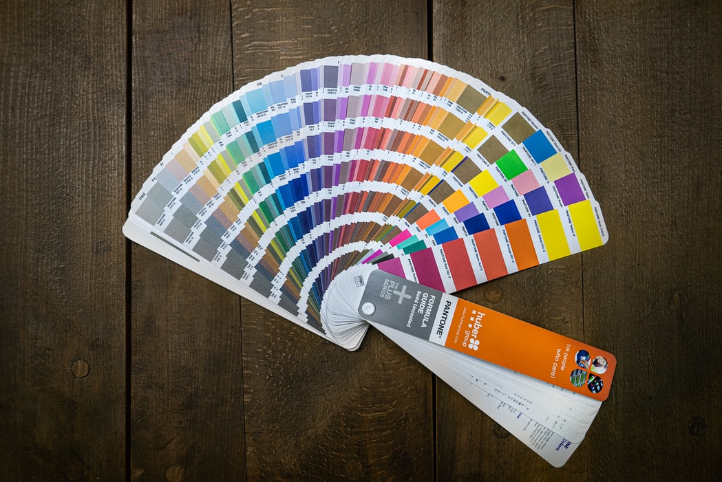
In essence, a color mixing chart is a table or a graphic representation of colors. They illustrate possible color combinations and different tints, tones, and shades of each hue.
A color mixing chart serves as a reference and learning tool to help artists gauge variations of pigments, as well as the properties that come along with these changes. They also provide information and inspiration as a gateway for discovering new shades.
Normally, a mixing chart is laid out in chromatic order. All of the hues are arranged in both horizontal and vertical rows, leaving room for combinations to form in between.
Basics of Color Mixing
Before fully grasping the art of combining hues, it’s vital that you familiarize yourself with the basics of color mixing.
At the very core of this are primary hues. In school, you may have learned about this basic color group comprised of blue, red, and yellow. These serve as the foundation for the creation of all other hues.
The secondary group, on the other hand, is formed by combining two primary hues. These include violet as a product of blue and red, green as a product of blue and yellow, and orange as the outcome of red and yellow.
Lastly, tertiary colors are made simply by adding one primary color to one secondary hue. Those that belong in this category include red-violet, red-orange, blue-green, blue-violet, yellow-green, and yellow-orange.
Fundamental Color Combinations and Proportions
Naturally, different quantities of each base color will create different hues. Therefore, it’s important to pay attention to your color proportions to ensure you can consistently recreate hues.
For example, one of the most basic approaches to color mixing and proportions is using ratios. A one-to-one (1:1) ratio means that you put exactly the same amount of each pigment, such as combining one part blue and one part yellow to create green. However, combining two parts blue with one part yellow can produce another hue, such as teal in this case.
Tints, Shades, and Tones: What’s the Difference?
Though primary colors are the most basic pigments, they don’t have to remain that way forever. In fact, you can create a variety of tones and shades by adding in white, black, or gray. In fact, when you add any of these three neutral hues, you are creating entirely new categories of color.
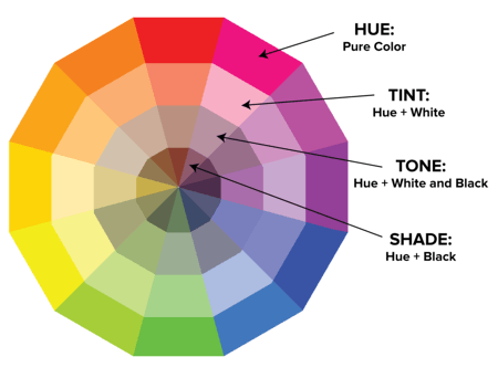
On one hand, combining white with any color creates a tint, while adding black to a pigment creates a shade. Meanwhile, adding gray to a color results in a tone. Adding these particular hues into the mix not only brings more complexity and flavor to the outcome, but they also lend more personality and body to the mix.
Color Mixing in Pop Culture
Today, color mixing is used in a variety of fields and industries. Apart from arts and painting, it is also used in fashion and design when producing a line for the season. The same goes for home design colors, most of which are achieved by combining specific hues to help bring the owner’s vision to life.
The Bottom Line
Now that you know the basics of color mixing, you can now make your own chart for reference and inspiration. Who knows, you might just bring about more innovative and imaginative combinations giving ‘color’ a whole new meaning.

Read Latest Posts


Hi, I'm Anthony Tran! Welcome to my site. I live in Arizona and am obsessed with all things related to building an Online Business and working from home. Learn about my journey here.
Follow Online