What Is the Opposite Color of Red
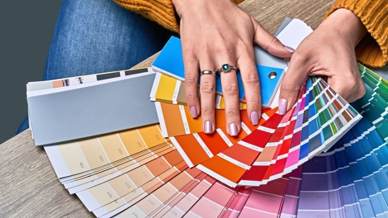
The complementary color of red is the color with the greatest contrast to the red. According to the 1892 paradigm known as opponent process theory, which posits that people see color as red versus green, blue versus yellow, and black versus white, the contrast to red is green.
Green and red are located directly across from one another on the color wheel. The terms “complementary” and “opposite” refer to the same phenomenon. Complementary colors are those colors on the color wheel that are “opposites” of each other.
When complementary colors are next to each other, they create a strong visual contrast. And they influence design in a new way.
Red

The color red holds connections with feelings of love, passion, desire, heat, longing, sensuality, romance, and joy. Red is an assertive and bold color that exudes an air of vitality and force.
It is a symbol of physical vigor, sensuality, and desire. You can’t help but take action when you see red. For many people, red is a hue that evokes the most basic physical, emotional, and economical necessities of survival.
It is a powerful hue that evokes a wide range of strong emotions, from passionate love to rage and violence.
Red is the color of love and the color of the devil. As a fiery, energizing hue, it symbolizes enthusiasm and vitality.
Blood pressure goes up, libido goes up, respiratory rates go up, metabolism goes up, the excitement goes up, and confidence goes up when you wear red.
What Is the Opposite Color of Red?
The Answer Is Green!
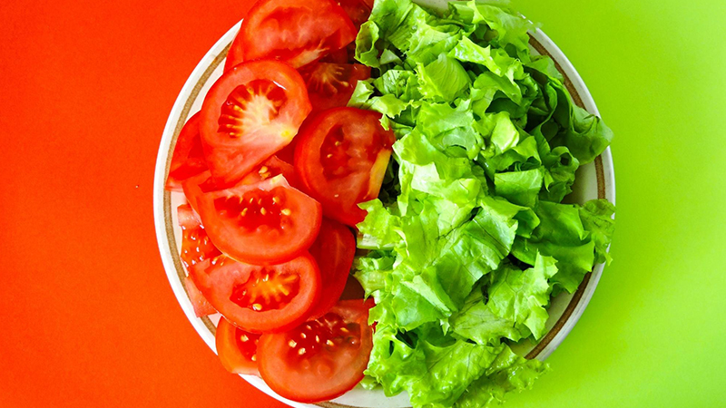
There are several connotations linked with the color green; these include freshness, fertility, harmony, and safety.
The color green has also long-held links with money, banking, ambition, greed, and other negative connotations.
If you’re looking for something that’s soothing and calming for your eyes, go no further than green. The benefits of green include improved eyesight, balance, and stamina.
Green dominates the visible spectrum and is the most prevalent hue in nature. Because we’re so used to seeing it, it’s an obvious option for a background or backdrop in interior design.
Being associated with regeneration, development, and optimism makes the color green a good metaphor for both a lack of experience and a desire to improve one’s situation.
Green also symbolizes rebirth and new beginnings, which is typical in the spring when all the plants are reviving from the cold winter months with new growth and life.
How to Use Red and Green in Interior Design
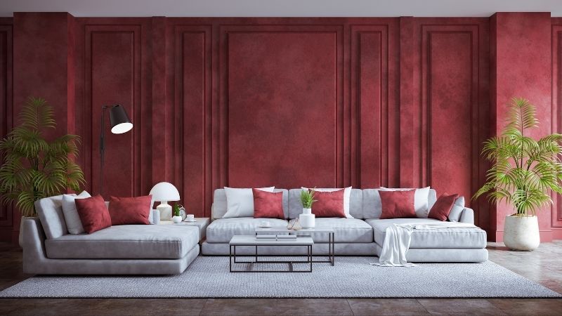
Muted tones of red and green anchor modern interior design ideas. When it comes to color schemes, green and red aren’t the most apparent pairing outside of Christmas.
When applied to interior palettes, however, red and green colors work together to create a harmonious blend that is both calming and comforting.
A plethora of white and soft gray regions, as well as contemporary furniture and materials, keep the color scheme fresh and airy.
For more contrast, bright red decorations fight with sage-colored canvas, drawing the eye away from the rest of the room to create a unique look.
Conclusion
In the food industry, the combination of red and green has long been popular since it stimulates the appetite while also conveying freshness.
But this combination can also work beautifully in design and fashion. Don’t be afraid to pair these complementary hues together!
Read Latest Posts

Hi, I'm Anthony Tran! Welcome to my site. I live in Arizona and am obsessed with all things related to building an Online Business and working from home. Learn about my journey here.
Follow Online


