What Colors Make Tiffany Blue? What Two Colors Make Tiffany Blue
Is your favorite color Tiffany Blue? If so, then you’re probably curious about what colors mixed together make Tiffany Blue. We share the answer in this article…
If jewelry makes your heart go aflutter, you are probably familiar with the medium robin-egg blue color associated with the crowd favorite Tiffany & Co.
As a matter of fact, you might have even seen Audrey Hepburn ogling the glass window of this store in Breakfast at Tiffany’s, where Holly Golightly dreams of the finest and most luxurious creations.
Created by Charles Lewis Tiffany, jeweler and founder of Tiffany & Co., this hue is made out of a bright green pigment with hints of light blue.
Today, the popularity of this hue goes beyond the iconic and classic blue boxes.
From clothing to interiors, this particular color has managed to snag just about everyone’s heart and has wiggled its way into various industries and businesses.
As an artist, or as an expressive individual, you can clearly visualize how a Tiffany blue color can make your creations pop and stand out from the crowd.
However, achieving this specific hue may be a challenge, especially if you are not aware of color mixing and what you can do with what you have on hand.
Because of this, it’s important that you know how to properly combine pigments together.
Not only can you create magnificent colors like this one, but you can also learn to go beyond the box and explore your capabilities as a person with an intrinsic appreciation for beauty.
Keep reading to find out how you can make a Tiffany blue color on your own…
Brief History of Tiffany Blue
This particular shade was specifically chosen by the founder, Charles Lewis Tiffany, for the brand’s Blue Book.
This Blue Book contained the yearly collection of creations made by the company.
The Pantone Color Institute helped this color come to life as they standardized this shade in 2001, bearing the name 1837 Blue in honor of the company’s founding year.
Tiffany blue was reportedly chosen by the founder himself primarily because the shade was largely popular during the 19th century, especially with the rise of the turquoise gemstone.
The shade is sometimes referred to as robin’s-egg blue, or forget-me-not blue, with a combination of green and blue in the mix.
The Fundamentals of Color Mixing
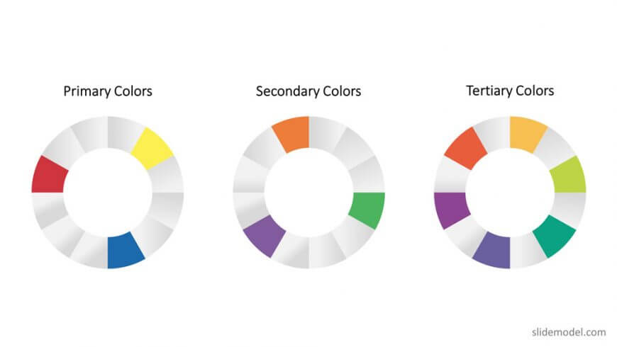
To start off, you must be aware that there are certain pigments that act as base tones for all other colors.
These are called primary hues and they are comprised of red, yellow, and blue.
Secondary hues, on the other hand, result from combining two primary hues together. These include orange, violet, and green.
Lastly, the third category is called tertiary colors, where the colors arise from mixing one primary and one secondary pigment together.
This category bears witness to vivid shades such as red-violet, red-orange, yellow-green, yellow-orange, blue-green, and blue-violet.
When placed in a circular diagram, we get the color wheel. This wheel demonstrates the relationship of hues to one another. Meanwhile, color theory dictates which hues work well together, especially in art and design.
What Two Colors Make Tiffany Blue
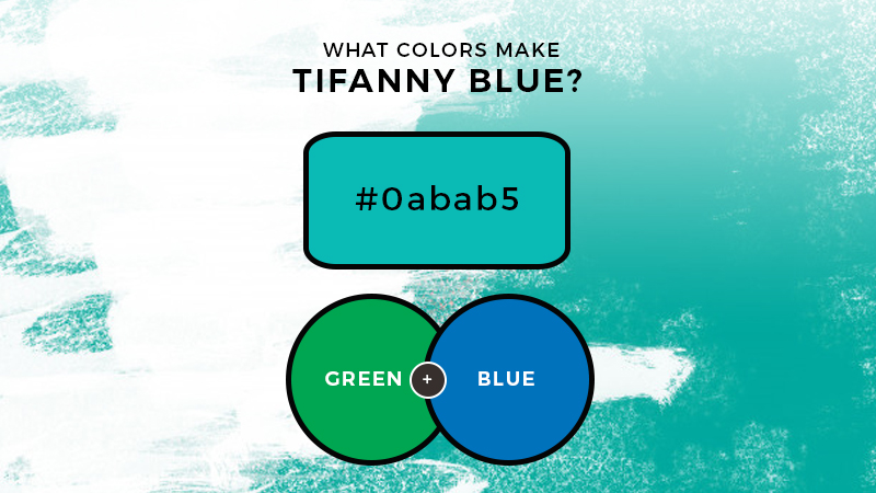
As we have said earlier, the distinguishing trait of Tiffany blue is the vibrant and elegant combination of blue and green.
While the greenish hue tends to take a backseat to give way to blue’s prominence, there is no denying that this shade is present in the mix.
By now, you might have an idea as to what colors make Tiffany blue.

If you guessed green and blue, you’re right!
Start off by combining blue with small amounts of green. In case you do not have green on hand, you may simply combine yellow and blue.
Mix well until the pigments have properly integrated with each other. Temper the brightness with white until you have achieved the desired color.
You may also start by creating a pale blue shade by combining blue with white. Then, add one part green to achieve a uniform outcome.
A piece of advice?
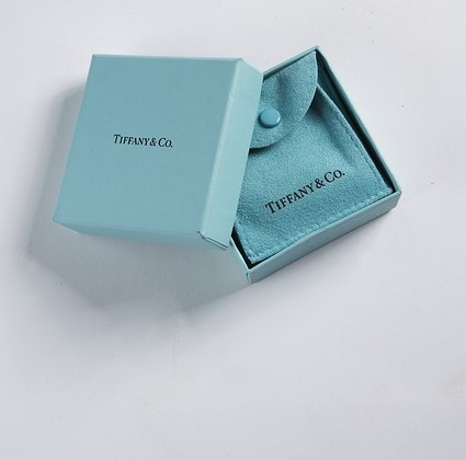
It’s best to have the elegant box with you for reference when experimenting with the palette.
Tiffany Blue in Design and Pop Culture
It’s no surprise that Tiffany blue has achieved cult status. From its luxury brand and elegant designs, the brand has almost become synonymous with its famed Tiffany blue packaging.
Due to its pastel hue, this color tends to evoke a sense of softness, relaxation, and serenity. It also reminds many individuals of the ocean. In interior design and art, this specific shade pairs well with white.
However, this pigment also works well with coral, pink, and even green for a rightful pop of complementary color.
The Bottom Line
Tiffany blue is definitely an iconic color that will certainly go down in history as one of the most fabulous creations known to mankind.
Now that you know how to achieve this shade on your own, you can give it a try and go crazy with numerous combinations. From manicures to wall accents, the world is your oyster.
Read Latest Posts

Hi, I'm Anthony Tran! Welcome to my site. I live in Arizona and am obsessed with all things related to building an Online Business and working from home. Learn about my journey here.
Follow Online


