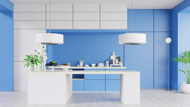
What Color Is Glaucous? About Glaucous Color
Are you curious about what color is Glaucous? Stick around as we share details about this wonderful color.
The color glaucous became a color name in English in the mid-1600s.
Glaucous also refers to plants with leaves that have a gray or blue covering that peels off. Read below for more about this color!
What Color Is Glaucous?

Glaucous was initially used in 1671 to describe the powdered blue-gray or blue-green covering on grapes and plums. However, glaucous is also Latin for “bright” or “gleaming.”
In terms of hue, it’s a shade of blue. More specifically, it’s part of the dull azure color subfamily. Glaucous is a botanical term that describes a plant with a grayish, bluish, or white waxy bloom that is easily wiped off.
The glaucous hue is 38% red, 51% green, and 71% blue.
Glaucous Color Code
The glaucous color hex code is #6082B6. Absolute RGB values range from 0 to 255, with 96 red, 130 green, and 181 blue being the lowest and highest values.
In other words, RGB stands for red, green, and blue (96, 130, 181).
Additionally, the glaucous color is composed of 46% cyan, 28% magenta, 0% yellow, and 29% black in the CMYK color model.
Using Glaucous Color in Interior Design

Glaucous color palettes are the latest craze in home design. Because it originally represented a blue-gray mix, the term “glaucous hue” has come to signify a tranquil and relaxing shade.
Interior designers frequently combine this color with pastels and dark hues.
The gray’s contrast with blue’s vivid colors is as crucial as the temperature balance they generate.
Glaucous blends beautifully with pastels and therefore is ideal for creating calming interiors.
Colors That Go Well With Glaucous
Red Goes Well with Glaucous
Pairing reds with glaucous is an eye-catching combination. Hearts race at the sight of the chilly tone contrasted with the warm colors.
On a glaucous background, red hues glisten, glowing with warmth and light from the inside.
Undoubtedly, there is more energy and beauty in deep crimson and icy glaucous than in other color combinations.
Yellow Goes Well with Glaucous
Colors like glaucous and yellow combine well with golden hues. The color schemes are fresh, cheerful, and well-balanced, echoing images of breathtaking sunsets.
Soft golden hues have a calming effect and are both energizing and fashionable.
Additionally, modern interiors benefit greatly from the romantic, light-filled color schemes created by the delicate blues and golden pastels.
Glaucous is a gold fanatic, just like a tranquil sea or a sunny sky. Pair bright yellows with greenish or brownish-golden hues in a variety of ways to add a warm touch to any room.
Conclusion
Glaucous represents a mild grayish-blue hue. Many interior designers choose this color in their designs since it’s one of the greatest options for a contemporary look.
Pair glaucous with reds, yellows, or pastels to achieve a bold, energizing, or calming interior.
Hope you enjoyed learning about the color glaucous.
Read Latest Posts

Hi, I'm Anthony Tran! Welcome to my site. I live in Arizona and am obsessed with all things related to building an Online Business and working from home. Learn about my journey here.
Follow Online


