What Color Is Cerise? About Cerise Color
Are you curious about what color is cerise? Stick around as we share details about this fun color.
Are you a pink lover? Then you must have a variety of things in shades of pink. But, did you know that beyond the popular pink, blush, and peach tones, there’s also Cerise?
Let’s find out about this color here.
What Color is Cerise?
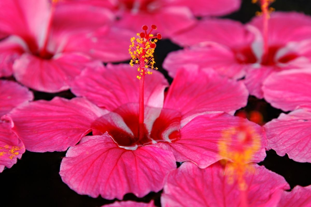
“Cerise” is near the hot pink tone, but it’s more likely to fall under the reddish-pink column in the color chart.
The name Cerise is a Norman term for cherry, and historically, the first record of using this color was way back in 1858.
The hexadecimal color code for the color Cerise is #cd0F63.
The RGB color value for the color Cerise is RGB (218,29,129).
Cerise is a color typically associated with the red color family. Its hue is a combination of magenta and pink tones.
The color Cerise has a lot of vibrancy and doesn’t go unnoticed by onlookers. It is daring and audacious, and it always makes a big statement.
Cerise is a young woman who is full of life, vibrancy, and electricity.
Cerise is frequently coupled with black, but it also works well with yellows and cyans, as well as, on the softer side, with white and light pinks as accent colors.
Using Cerise Color in Decorating Your Home
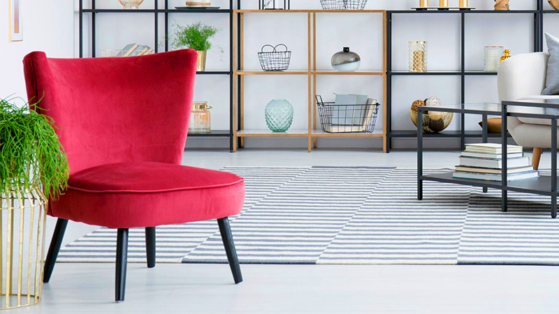
Cerise is most commonly found in house interiors as decorative accessories.
When used sparingly, it looks remarkably brilliant in the living room and bedroom. It should only appear as an accent to draw attention to its distinctiveness.
Some homeowners are so taken with the hue Cerise that they decide to use it on their walls as well.
There’s nothing wrong with painting only one wall, as long as you keep the rest of the room neutral. The color is particularly striking when paired with white or charcoal accessories.
A complete room painted in Cerise seems a little excessive. It may be difficult to concentrate or relax in a space painted such a bright color.
If you spend more than a few days in a pink room, you will most likely wish to repaint it.
Also, bear in mind that using too much Cerise in your home’s interior design will not work.
However, nothing prevents you from utilizing it as an accessory. This hue can decorate a variety of items, including an armchair, a sofa, cushions, flower vases, and more.
In terms of interior color, Cerise goes well with both bright and neutral decor.
You may use it to embellish a white or gray living room, depending on your preference. It looks great with beige and pastel hues as well as other neutrals.
If you choose the latter option, be careful not to overdo it by combining too many colors at once.
Colors That Go With Cerise

Cerise may be used with a variety of other colors to create a unique look.
It looks very dominating when coupled with black, but it also stands out when matched with lime green, which is the color wheel’s complementary color.
Using Cerise with a bright yellow or orange provides a striking, eye-catching color scheme; nevertheless, the hue also works well with cool grays.
Lime green, mint, orange, yellow, black, and white are just a few of the hues that go nicely with Cerise.
Meaning of Color Cerise

This vibrant color is a wonderful combination of red and purple tones.
Cerise is a psychological metaphor for being confident in one’s own skin.
The hue is as calm as a cucumber, thanks to her laid-back demeanor and unwavering self-belief in her abilities.
Cerise is very aware of who it is, and it makes no apologies for being so certain of itself.
Unfortunately, folks who are self-conscious consider Cerise to be conceited. This color, however, is not self-absorbed.
The word “vain” or “conceited” makes Cerise feel offended, which is why it encourages people to see its self-assurance as nothing but confidence.
According to research, Cerise is very caring and mature in her approach. When people seek good guidance, they often turn to Cerise.
Having been through the mill, this color has learned to persevere in the face of hardship.
Cerise will never pass judgment on you because of the difficulties you are going through.
Instead, it will act as a shoulder for you to cry on. You can discover calm and relaxation while you are with Cerise.
Cerise’s loving character creates an atmosphere that is warm and friendly.
Conclusion
Cerise is a great pink color that will surely make you feel good and independent. Its vibrant hue gives it more authority.
You can also match this color with other hues, just make sure not to overuse it.

Read Latest Posts


Hi, I'm Anthony Tran! Welcome to my site. I live in Arizona and am obsessed with all things related to building an Online Business and working from home. Learn about my journey here.
Follow Online