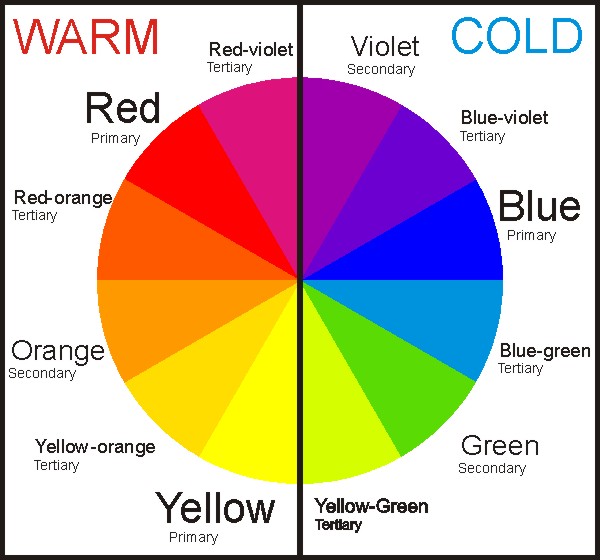
What Are Warm and Cool Colors in Art? Learn the Difference
Are you curious about what is the difference between warm and cool colors? Stick around as we explain how they are different.
Look back to your grade school art education and try to remember some of the earliest things you learned about colors. The color wheel, composed of primary, secondary, and tertiary colors, is one of the most basic concepts taught to children.
Aside from these your teacher probably taught you about warm and cool colors. These two groups are some of the most fundamental categorizations of colors. For those who fail to remember what these are, a refresher is what you need.
Ready to revisit what warm and cool colors are? Keep reading…
What are Warm Colors?
These hues are those that have reddish, yellowish, and orangish characteristics to them. They are called warm because they are the colors that warm things have. When talking about warm hues, the best way to describe them is to identify things that bear such colors. This includes fire, the sun, and embers.
Aside from being called warm colors, these are also called advancing hues. They are called such because they tend to ‘advance’ as compared to cool colors.
If you are not sure what this means, just think about something that is colored red, orange, or yellow. In your perception, these things seem to come closer to you.
This is because reds, oranges, and yellows have the longest wavelengths. Our eyes have cones that are sensitive to an array of wavelengths namely the red, green, and blue cones. The red cone can sense a wide range of wavelengths, which makes it perceptive to reds, oranges, yellows, and even greens.
Ideas Associated with Warm Colors
Colors that belong to this group tend to be seen as comforting, inviting, and cozy hues. Because of this, warm colors are associated with security and love. These concepts are closely associated with home and family, which can then evoke feelings of hunger, longing, and passion.
Because warm hues are named after things that exude heat, they are also linked to ideas that stimulate the mind and body. Reds, oranges, and yellows are associated with alertness, activity, and urgency.
Think about brands and items that have warm colors. In marketing, red is used to evoke hunger, which is why many restaurant chains such as McDonald’s, Wendy’s, and Five Guys use red as a dominant color in their branding.
The meaning of colors can vary depending on their intensity. For example, a bright red can symbolize urgent matters, while a deeper and darker version can mean passion and desire. The same goes for oranges and yellows.
What are Cool Colors?
Cool colors are called such primarily because they exude a sense of soothing and a feeling of being cool and calm. These tones tend to appear receding, thus having the capability to make a small room seem much bigger than it usually is.
Some of the hues that typically fall into this category are blues, greens, and light purple. Neutrals such as white, gray, and silver also belong to this group.
These colors tend to evoke images of clouds, the sky, and water, as well as ice and snow – all of which are associated with a sense of coolness. Whereas warm tones can energize individuals and put them in a happier disposition, cool colors have the opposite effect.
Instead, these hues enjoin the viewer to feel more relaxed, calmer and even more refreshed. At times, these shades may also appear meditative to the viewer, which explains why these colors are often used not just in bedrooms, but also in bathrooms and restrooms.
Ideas Associated with Cool Colors
As mentioned, cool colors tend to evoke a sense of refreshment and even wisdom. They have a calming effect and command a colder and soothing appearance to the eyes.
When talking about cool colors, one may naturally think about nature and the blue skies, the ephemeral color of the forest and the trees, and the deep blue seas. These things are associated with calmness, tranquility, and reflection.
Because cool colors are associated with a feeling of coldness, they can also evoke feelings of sadness, isolation, and despair. Just think about Elsa in Frozen. It is also linked with the coldness of the heart, just like the White Witch in the Chronicles of Narnia.
Now, think of products and establishments that bear cool hues. You might think of wellness and recreational centers, care products, and even hospitals. This is because blue is used in marketing to show refreshment, rejuvenation, and other similar ideas.
However, like warm hues, the meaning of cool ones can vary depending on their intensity. For example, an icy blue can depict harshness, while a deeper one can signify gloominess.
The Bottom Line
Warm and cool colors have unique characteristics that make them fit the thoughts, concepts, and emotions attached to them. So, make sure to think about these associated ideas when using colors in design and art.
Read Latest Posts

Hi, I'm Anthony Tran! Welcome to my site. I live in Arizona and am obsessed with all things related to building an Online Business and working from home. Learn about my journey here.
Follow Online


