How to Use Brown Watercolor in Art History and Design
In love with the color brown? Although often ignored, there’s something about this earthy color that makes it fascinating.
From its dependable vibe, distinct elegance, and humble charm, it’s no surprise that the color is back in the mainstream.
If you’re one among the many who find themselves magnetized by this color, knowing how to take advantage of it in your art will help you appreciate the pigment even more.
Whether you want to emphasize a theme, create a particular vibe, or reflect on what’s right in front of you, here is a brief guide that will help you understand how to use brown watercolor in your painting properly.
Excited to know how? Read on ….
What Is the Color Brown?
Brown – the color of woods; the soul of the rich soil; the pigment that gives charm to chocolates; the picture of chestnuts.
If we were to ask anyone to enumerate all the things they associate with this color, it’s safe to assume that the list would be endless.
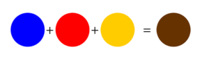
In color theory, brown is identified as a composite color. This means that it can be created by combining the colors red, yellow, and brown together.
Traditionally, unlike primary, secondary, and tertiary colors, this natural pigment can’t be located in the color wheel. However, modern versions now present brown as a shade of orange (orange + black).
Generally, just like all other colors, brown has many varieties. From deep chocolates to bright taupes, a range of hues make up the general brown category.
Perhaps the most popular among them include metallic copper and pale beige.
Meanings of the Color Brown – How to Use It in Your Painting
In color psychology and in general, brown is loaded with varying meanings. Similar to black, it has its fair share of both negatives and positives.
Specifically, since its often associated with soil, it symbolizes dirt, barbarism, and poverty.
In fashion and design, it is regarded as “dull,” “plain,” and “boring.” Unlike green, which is famous for its vibrancy, brown has been limited to its rawness and simplicity.
In fact, in history, color has been perceived as a symbol of the lower class. Since the poor didn’t have the economic power to dye their clothes with colored pigments, they were left with no other choice but to settle for wearing natural colors.
This explains why the urban poor in Ancient Rome were called pullati, which translates to “those dressed in brown.”
However, despite these connotations, the color still evolved and took on many positive meanings.
Its presence on the earth, especially, made it a symbol of stability and reliability. As the global climate now heightens the need for sustainable designs, the pigment has also emerged as a symbol of comfort, humility, and naturalness.
Its association with the woods has also provided the pigment with meanings such as dependability, stabilization, and solidness.
Depending on how you are going to apply the color in your art, you can either emphasize its negative connotations or take advantage of its positive suggestions.
Experimenting With Your Watercolor: Maximizing Brown
- Red + Blue + Yellow = Brown
- Bright Violet + Cool Yellow = Golden Brown
- Orange + Blue = Burnt Sienna
- Cool Blue + Warm Red = Chocolate Brown
Brown’s Complementary Color
If you’re looking for the right hue to match your brown watercolor, turning to the traditional color wheel will help you arrive at the right color choices.
Specifically, since brown is now considered to be a shade of orange, turning to orange’s complementary color, which is blue, will help you create a strong contrast that can make your art appear more vivid and lively.
Aside from this, you may also opt to use this natural color along with other neutral shades, such as black and gray, to maintain a subtle, dark, and somewhat raw vibe.
Palette Suggestions:
- Brown + Blue = to make the blueness pop-out
- Brown + Maroon, Pink, and Olive = to create an elegant vibe
- Brown + Orange = to create an autumn vibe
The Bottom Line
Impressed by our brief guide on how you can use and maximize your brown watercolor?
From cozy houses, fresh-from-the-pan bread, and raw woods, to many more, a ton of scenes require the use of this natural pigment.
Take advantage of your brown watercolor. Express your thoughts with vivid accuracy using this incredible pigment.
Experiment with your brown watercolor today!

Read Latest Posts


Hi, I'm Anthony Tran! Welcome to my site. I live in Arizona and am obsessed with all things related to building an Online Business and working from home. Learn about my journey here.
Follow Online