What Color is Cerulean? About Cerulean Color
Are you wondering what color is cerulean? Learn more about this shade of blue in this article.
At first glance, cerulean appears just like any color that is a part of the blue family. As a matter of fact, Andy Sachs (Anne Hathaway) in The Devil Wears Prada made this mistake.
And what a mistake this was. It prompted the editor, Miranda Priestly, played by Meryl Streep, to launch a monologue that differentiates cerulean from other blues.
While Miranda Priestly is a fictional character, she is by no means wrong about her take on cerulean. It is, after all, unique from other blues.
For those who are just as clueless as Hathaway’s character in the film, fret not. This article will give a more detailed look at the cerulean color.
Read on to know more about this hue, and you might gain a deeper appreciation for this color.
What is Cerulean Color?

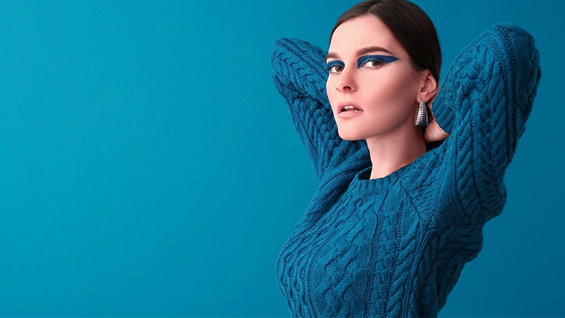
Cerulean is a true blue color between azure, teal, and sky blue. It is a deep and darker blue that is bright and opaque thanks to its refractive particles.
The name “cerulean” comes from the Latin word caerleus, which means “dark blue” or “blue-green.” This is said to be a dissimilation of the word caelulum, which means “sky” or “heaven.”
This is also considered a type of pigment, the latter of which is referred to as cerulean blue. This pigment was discovered back in the late eighteenth century by Albrecht Höpfner.
However, it was only first called cerulean blue in the nineteenth century.
Cerulean Color Code
If you need the color code for cerulean here it is.
The color cerulean’s hex code is #007BA7.
On the RGB color scale, its values are 0, 123, and 167, respectively. This means that it contains 0% red, 42% green, and 58% blue.
Meanwhile, on the HSV scale, cerulean has a corresponding hue of 196°, 100% saturation, and 65% brightness.
On the CMYK color scale, cerulean contains 100% cyan, 26% magenta, 0% yellow, and 35% black.
What is the Meaning of Cerulean Color?

The color cerulean belongs to the blue family. Its color closely resembles that of the sky, which may be why it is named after the Latin word for sky.
It evokes feelings of peace and lightness as well as serenity due to its resemblance to water and the outdoors.
The meaning behind the color cerulean certainly is apt. In fact, even the Pantone Institute agrees with cerulean’s symbolism.
The institute designated cerulean as the Pantone Color of the Year in 2000. They said the color gives a feeling of calmness amid the changing times.
According to Pantone, cerulean (color code 15-4020) is the “color of the millennium.” It is for those who desire inner peace and fulfillment despite entering uncertain yet exciting times.
They also described cerulean as “the color of the sky on a serene, crystal clear day,” suggesting this color brings tranquility.
Besides this, cerulean is also closely linked to feelings of nostalgia, melancholy, and even sadness, mainly due to being part of the blue family.
How to Use Cerulean Color in Design
Meryl Streep’s cerulean monologue captures one of the greatest and most iconic moments in the film. It showcases how the fashion industry works.
Streep berates Hathaway in the film, who snickers and says that she cannot see the difference between the blue belt colors.
Streep turns this into a learning opportunity about cerulean—the color of the sweater Hathaway is wearing—and explains the color’s influence on the fashion industry.
This was prominent in Oscar de la Renta’s 2002 cerulean gown collection as well as YSL’s military jacket collection.
Besides film, this color also shows itself in various works of art. The use of the color cerulean was prominent in the work of renowned impressionist painter Claude Monet in The Gare Saint-Lazare as well as that of Édouard Manet’s Corner of a Café Concert.
This color was also observed in Paul Signac’s works, most of which were stylized in pointillism.
Colors That Go Well with Cerulean

Those who are thinking of incorporating cerulean in their home or wardrobe should start by using it with white, creams, and beiges.
The soft and neutral colors work well together to bring feelings of calmness and tranquility, both of which are usually associated with the sea.
Since orange is the complementary color of blue on the color wheel, this pairing also works well. The orange brings a sense of vibrance and energy that goes perfectly with cerulean blue.
You can also go monochromatic and work with different shades of blue.
This will make for a great play on colors while adding a bit of eye-catching interest with textures and layers.
The Bottom Line
The color cerulean may go down as one of history’s most defining and iconic colors. Now that you know more about it, use this color and create a look that’s one for the books!
Read Latest Posts

Hi, I'm Anthony Tran! Welcome to my site. I live in Arizona and am obsessed with all things related to building an Online Business and working from home. Learn about my journey here.
Follow Online


