What Colors Make Crimson? What Two Colors Make Crimson
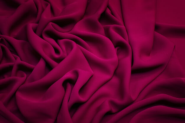
Perhaps it can be safely said that no other pigment in the color spectrum suggests romance and danger more than crimson. It is, after all, the color that gives life to roses, wine, blood, and certain precious stones such as rubies and garnets.
In art alone, this strong, red hue that is close to purple is often used to signify love and wildness.
Given its vibrant and conspicuous color, it has served as an important element in enlivening a piece of work or adding a touch of mystery to it.
If you’re among the many eyeing to use this deep, bright pigment in your art, knowing how to recreate it in case you lack ready-made crimson paint is essential.
To help you with that, here is a brief guide that will help you identify the proper colors and mixing strategies that will lead you to your desired crimson shade and tone.
Read on…
Reviewing the Color Wheel
Of course, before we dive straight into discussing the colors that make crimson, it is important to have a fair understanding of the art of color mixing first. In order to do so, it is essential to familiarize yourself with what we call the “Color Wheel.”
For many, hearing the word already evokes an image of a circle illustrating the organization of color hues. It is, after all, a topic that is reserved for primary school.
However, to help you understand it a little better, here are a few important things you need to know about the Color Wheel:
-
It’s an important tool for artists and designers
Of course, the Color Wheel isn’t arranged randomly. In fact, the organization of the colors within the circle was specifically designed to display the relationship between colors and help artists determine which pairings evoke the right emotions and which ones don’t.
-
It is broken into three categories
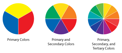
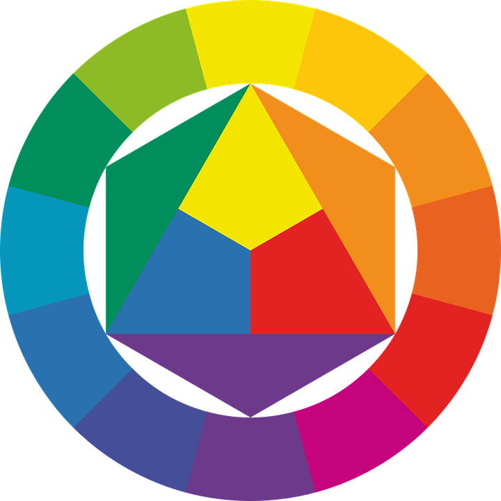
In color theory, another important thing you need to know about the color wheel is that it is composed of three distinct categories: primary, secondary, and tertiary. Here is how each one differs:
-
Primary Colors
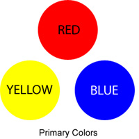
As the name suggests, the primary category refers to colors that are the basic form of any color structure. This means that these pigments serve as the parents for all other succeeding colors.
These include yellow, red, and blue.
-
Secondary Colors
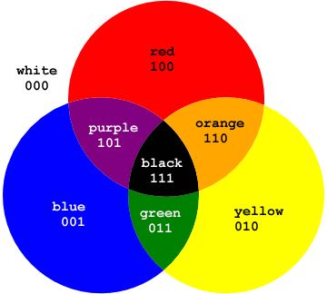
Meanwhile, the second category refers to the types of colors that are derived by mixing two primary colors together. These consist of the colors orange (yellow + red), purple (red + blue), and green (blue + yellow).
Generally, secondary colors can be achieved by mixing equal amounts of two primary colors. However, depending on your desired outcome, you can manipulate the portions of each color ingredient and adjust the shade or brightness of your preferred secondary pigment.
-
Tertiary Colors
Lastly, tertiary colors refer to the type of colors that can be derived by mixing a primary color with a secondary color. They are often named after the colors used to make them: red-orange, yellow-orange, yellow-green, blue-green, blue-violet, and red-violet.
Since tertiary colors require the use of a primary and a secondary, they are often quite tricky to create. With this, artists often engage in trial-and-error methodologies until they arrive at their desired shade and tone.
What Colors Make Crimson
Now that you’ve had a brief recap of the Color Wheel, it might now be easier for you to identify the proper ways to replicate crimson using only the art of color mixing.
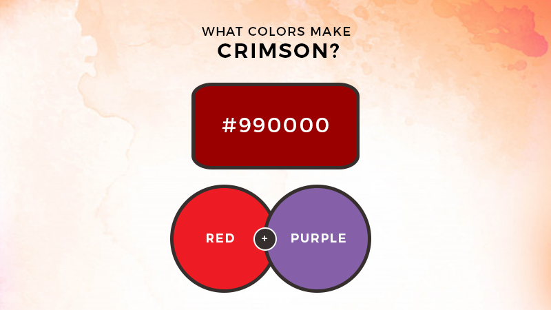
Basically, since crimson comes as a strong, red color with purple undertones, you might have already guessed that recreating it would require the use of a primary and a secondary color.
So what two colors make crimson you wonder?
Specifically, mixing red and purple together will make a crimson color.
However, since crimson is only slightly inclined towards purple, you’ll need to identify the right ratio of each color ingredient to actually arrive at your desired result.
In order to do so, it is wise to mix a small amount of paint at a time until you reach your preferred hue. To make the result even more desirable, try adding some white paint to the mixture to neutralize the dark colors.
Crimson in Design
As mentioned earlier, the deep and rich color of crimson makes it an appealing element in art and design.
Specifically, this color is often used to heighten the emotion, strength, and power that comes with a particular artwork.
Since red, in general, represents strong emotional associations compared to other colors, crimson, as its deeper variant, is used to suggest anger, passion, mysticality, and danger.
The Bottom Line
Ready to complete your artwork with the use of crimson? Prepare your paint, set up the canvas, and kick-start your artistic venture today.
Don’t hesitate to experiment and try out different color-mixing ratios to come up with your desired crimson shade and tone.
We hope this article helped you a lot.
Read Latest Posts

Hi, I'm Anthony Tran! Welcome to my site. I live in Arizona and am obsessed with all things related to building an Online Business and working from home. Learn about my journey here.
Follow Online

