What Colors Make Plum? How to Make Plum Color
This article will let you in on the workings of achieving the color plum.
Upon hearing the word ‘plum,’ your mind might automatically think about the plump and juicy fruit, and you are not wrong. You may even think about royalty such as kings, queens, and everything plush.
Another thing that might immediately come to mind is the color purple. While the foundation of this color is not far from violet, the color plum lies much farther on the spectrum.
For those wondering how to make this tone, keep reading…
If you look closely, the color plum takes on a deeper, and typically duller, appearance compared to similar tones and hues in the violet spectrum. Because of its distinctive hues, achieving this color might be a challenge for some.
Are you thinking about where you’ll use your new knowledge about mixing this color? From painting with this shade to use in your home renovation, there are many avenues where you can use this particular color.
To help you fully grasp how color mixing works, reviewing the basics of color theory is essential.
The Color Theory and Its Relevance
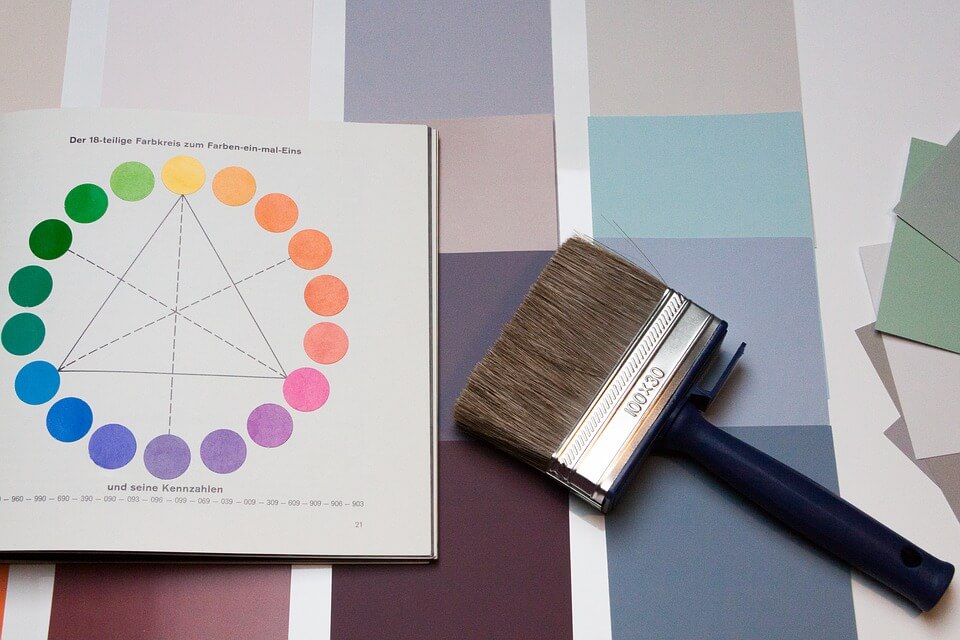
As a child, your school teacher might have introduced you to a simpler version of color theory. Here, the lessons you gained included knowing the colors that sit next to each other on the color wheel.
To give you more knowledge on the topic, let’s get a little deeper into understanding what the color wheel is and the colors included in it.
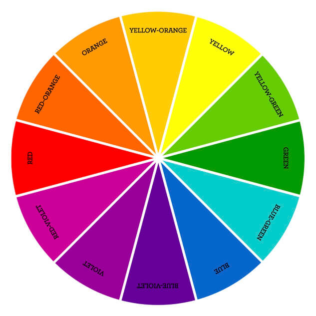
Three main color groups are found within the color wheel. These include primary, secondary, and tertiary colors. Primary colors are comprised of three colors, namely blue, red, and yellow.
Secondary colors, on the other hand, come out when two primary colors are mixed with one another. The combination of these colors results in purple or violet, green, and orange.
Meanwhile, tertiary colors are what you get when you combine a secondary color with a primary one. These include red-orange, red-violet, blue-green, blue-violet, yellow-orange, and yellow-green.
Where does plum fit in? The answer might surprise you.
Plum is actually a quaternary color! A quaternary color is a combination of two tertiary colors. To further understand how this color is achieved, make sure to stay tuned.
What Colors Make Plum
Plum takes on a purplish tone tinged with greys and browns, making it seem complicated to achieve. As a quaternary color, this color is created by mixing two tertiary colors.
These are russet and slate. Russet is a combination of orange and purple, while slate is made by blending purple and green.
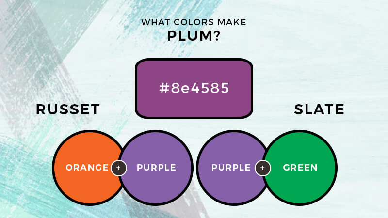
However, if you do not have these on hand, fret not. You can obtain the color plum by combining three primary colors.
Red and blue together result in violet. Yellow and red, on the other hand, come out as orange. Mix this with the purple shade to get a russet or a brow-tinged hue.
To get slate, you can get green by combining the primary colors blue and yellow. Then, mix this with purple.
In a pinch, a deep plum color only requires two primary tones, namely red and blue. Deepen this mixture by adding a bit of black.
There you have it! While getting this color might appear challenging at first, all you need is some patience and the willingness to experiment until you develop this particular shade.
Plum in Design
Upon achieving your desired outcome, you can use it for just about any design – or art form – you think of. If you are in need of inspiration, take a look at how you can further incorporate this into different aspects of your life.
Bearing similarities with the color purple, plum often symbolizes power, royalty, and opulence.
In interior design, plum can be used as an accent color for walls. Depending on the approach, this can either be used for a more traditional setting or a more contemporary look. This color also works great for fabric linings such as curtains and drapes. Heavy velvet drapes complement old-world styles and period pieces.
A jewel-toned couch filled with colorful pillows within the violet spectrum would also work well. Gold accents may also fit a luxe-themed interior.
Seen as a more mature and sophisticated color, plum is typically used for events such as weddings and other similar milestones. Light grays and greens can also elevate and soften the otherwise dark tone.
Other complementary hues that keep this color from becoming too dark are yellows, reds, greens, and even neutral tones.
The Bottom Line
Now that you understand how to make this tone, you may be more confident in mixing and experimenting with the colors you have on hand. Whether you are an artist looking to perfect your work or someone who’s into interior design, learning how to work with plum will certainly come in handy.

Read Latest Posts


Hi, I'm Anthony Tran! Welcome to my site. I live in Arizona and am obsessed with all things related to building an Online Business and working from home. Learn about my journey here.
Follow Online