What Is the Opposite Color of Gold?
To gain a better understanding of the color gold we should learn what colors complement it and find out what the opposite of the color gold is. A wide range of RGB values can simulate the color metallic gold. The hex code #D4AF37 or RGB values of 212, 175, and 55 can create a web-friendly rendition of gold. Gold has long-held links with wealth and success, but it can also be a symbol of ostentation and excess. The color of gold is a deep, rich yellow, named for the valuable mineral.
While the conventional painter’s color wheel does not include metallic gold, it does include gold’s non-metallic incarnation. It is a yellow-orange hue that falls somewhere between yellow and yellow-orange on the color wheel.
What Is Gold?
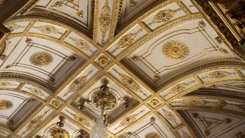
Of all hues, gold is the most materialistic, denoting wealth, extravagance, and opulence. As with yellow, dazzling gold possesses some of the psychological qualities of optimism and happiness.
In addition to being more antique, darker golds with a greater brown undertone provide an air of heaviness and conservatism to designs.
The hue is positively glitzy, conjuring up images of fun, festivities, and a night on the town. Excessive usage of gold, on the other hand, might denote a person’s materialism, greed, and vulgarity.
Fashion firms such as Moschino and John Galliano use gold to produce clothes that emphasize flamboyance and excess, which is a satire on kitsch and nouveau riche culture.
Buddhism and gold go hand in hand. It is a representation of enlightenment, innocence, and joy. Metalized gold or cold-plated Buddha statues are the most common finishes.
It is frequently used to denote exceptional quality or ability in a language. Olympic victors receive gold medals; the “gold standard” is a symbol of exceptional quality or service; and a “golden kid” is a particularly gifted or favored individual.
What Is the Opposite Color of Gold
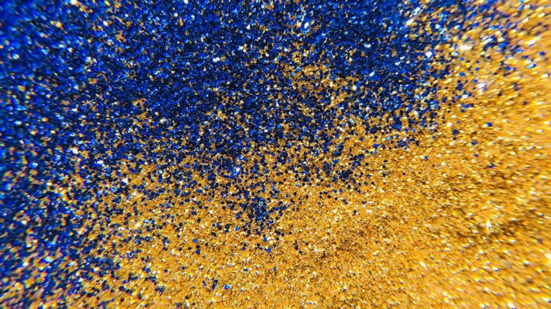
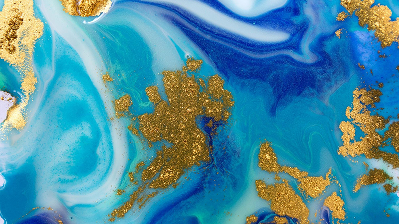
Blue is the hue that complements gold. Purple blue is best complemented by darker gold, such as old gold. In the case of complementary colors, a grayscale color, such as white or black, forms when the two hues merge or mix.
It’s best to put them adjacent to each other to get the best contrast between the two hues. Complementary colors, or opposing colors, are often known as polar opposites.
Two colors on the color wheel that are opposite each other are used to create complementary color schemes. Red-cyan, green-magenta, and blue-yellow are some examples of these color combinations.
What Is Blue
The color blue symbolizes the healing properties of water and the destructive force of stormy waves. Blue is also a symbol of devotion and commitment. The color blue has a calm disposition. It’s not intrusive or bothersome. Instead, it just announces its presence.
As a color that symbolizes patience and understanding, blue is one of our favorites. Blue is a calming hue, perfect to use when we’re feeling overwhelmed by our feelings.
Aside from that, it’s often connected with the ocean, which adds to its relaxing qualities. In fact, blue really does have a calming effect on the human brain.
How To Design With Gold and Blue
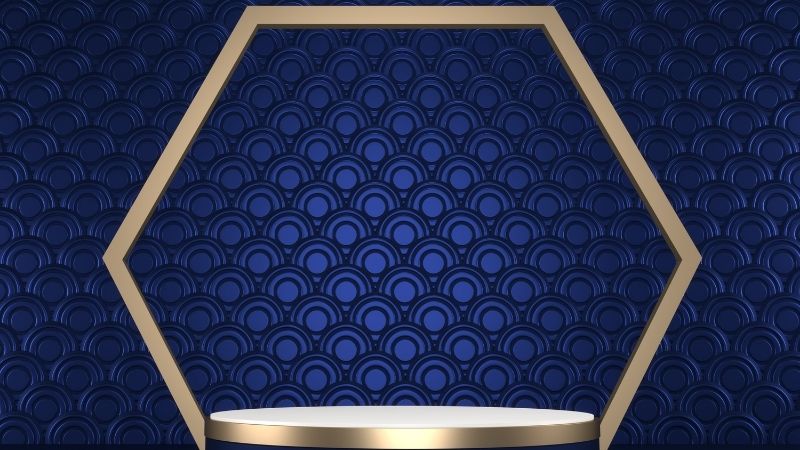
You can’t go wrong using gold in your designs, since it conjures up images of riches and success. To prevent seeming cheap, use gold sparingly and just as an accent color, rather than as the primary color.
Gold may be an excellent way to make items and brands seem a little more unique. The extra cost of metallic foiling is well worth the added value that a modest flash of metallic gold color can offer a brochure or business card.
Takeaway
It’s hard to imagine anything more opulent or extravagant than gold, which is a metallic yellow. However, in the wrong hands, it can appear too flashy or tacky, making it unsuitable for excessive use in interior design.
If you’re trying for a royal or nautical theme, blue and gold are surefire winners.

Read Latest Posts


Hi, I'm Anthony Tran! Welcome to my site. I live in Arizona and am obsessed with all things related to building an Online Business and working from home. Learn about my journey here.
Follow Online