What Is Opaque Color? Opaque Color Defined
Curious about what “opaque color” means? Whether crafting with paper, paints, or even images, you will surely encounter the word “opaque.”
In science, the term has been identified as the opposite of the word “transparent.” However, does the same meaning apply in the field of art and design?
Here, we have prepared a comprehensive guide that will help you identify what an opaque color means – and how you could possibly use them in your art, fashion, and other creations.
Read on…
Defining Opaque Color
As mentioned earlier, the word “opaque” has always been part of our vocabulary. In science, especially, it is the word used to refer to objects that are resistant to the transmission of certain types of radiant energy, especially light.
Concrete, wood, and metal, for example, are among the most common objects referred to as opaque. Compared to transparent materials, such as glass, which enable you to see what is behind them, opaque objects don’t allow any light to pass through them.
This is the reason why you cannot see through a solid object, such as a wall, book, and wooden material.
Coming from this meaning, when applied in art, opaque colors also carry the same role. Specifically, these are the types of pigments that hide or totally block what is underneath them.
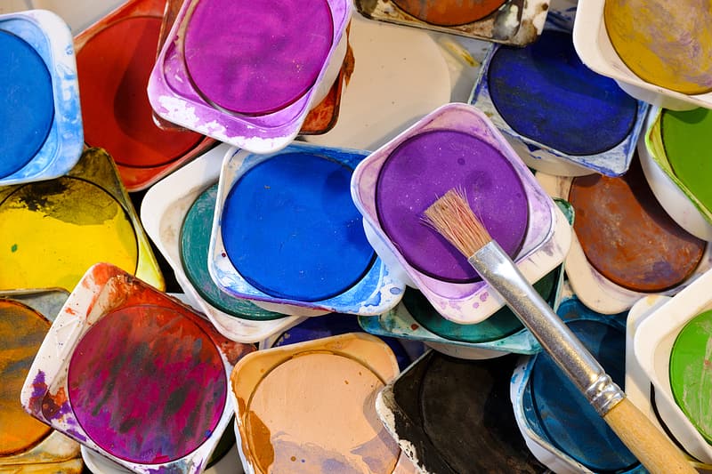
Generally, paints carry different degrees of opacity. Depending on the concentration of pigment used in creating a paint, it can either come out as opaque or transparent.
Specifically, the more pigment that is added to the mixture, the more opaque it will be. Because of this, any color can become opaque, depending on how much pigment was used in creating the paint.
How to Tell if Your Paint Is Opaque or Not
Interestingly, there are certain pigments that are naturally more opaque than other colors, such as titanium white and cadmium red.
However, in the case of other colors, it’s quite tricky to determine whether they are opaque, transparent (opposite of opaque), or translucent (semitransparent).
Oftentimes, artists rely on the information provided by paint manufacturers to distinguish opaque colors from those that are not.
In most paint brands, for example, you can find a circle printed on the label of the container. If the circle is filled, this means that the product is an opaque color.
Meanwhile, if it’s empty, this means that the paint is transparent. A semi-filled circle indicates a translucent color.
However, this label is limited to notable brands in the painting industry. Oftentimes, you may come upon paint that does not bear any marking to help you determine opaque from transparent and translucent colors.
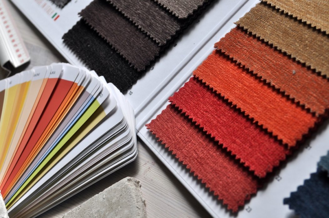
In case of such a dilemma, you may ask to see whether there is an available paint swatch or a paint catalog that will help you classify the different types of color according to their opacity.
Using Opaque Colors in Art
Generally, when used in paintings, opaque colors are recognized for their vibrancy and enthusiasm. Unlike transparent colors, which are often used to create more natural-like scenes, opaque hues are utilized to give artwork more life and vividness.
However, on the downside, due to their higher pigment concentration, opaque colors are relatively more difficult to blend compared to transparent and translucent ones.
Without the right technique, the paints won’t mingle well and may even ruin your overall art.
Changing the Opacity
In case you need to change a paint’s opacity, there are certain methods you can follow to arrive at your preferred result to match your artistic needs.
Specifically, if you want to transform an opaque color into a transparent one, you only need to add acrylic, oil, or another appropriate medium to the paint until it lightens and becomes transparent.
On the other hand, if you want to heighten the opacity of a color, you will need to add opaque paint of the same color to make the material denser.
When dealing with transparent red, for instance, mixing in several parts of cadmium red will help you boost the opacity of the color.
The Bottom Line
Have you learned something through our discussion of opaque colors? We hope you did! Known for their vivacity and apparent vigor, opaque colors are the best bet if you want to enliven your art and design and make it as vivid as it can be.
Learn more about the possible ways to take advantage of these bright pigments by experimenting with opaque colors today!
Read Latest Posts

Hi, I'm Anthony Tran! Welcome to my site. I live in Arizona and am obsessed with all things related to building an Online Business and working from home. Learn about my journey here.
Follow Online


