What Colors Make Turquoise? How to Make Turquoise
In this article, we’re going to discuss what colors make turquoise and answer the question of how you can make turquoise on your own.
What kind of feelings do you get when you see the color turquoise? Does it remind you of the ocean?
Perhaps it helps you feel calm when you’re feeling nervous or anxious. Regardless of your connection to the color, we can all agree that turquoise is one of the more brilliant and fascinating hues out there.
Today we’re going to look at what colors make turquoise, as well as discuss its importance in design and art.
This is a color that can spark creativity and add class and elegance to a piece, which is why it’s so crucial to understanding as much about it as possible.
If you’ve ever been curious as to how to make turquoise, you will appreciate what this article has to offer.
Color Theory: Turquoise
As always, our first step in understanding color is to see how it exists in relation to others. Since color doesn’t exist in a vacuum, it’s essential that we look at how they interact and form, both naturally and in man-made situations.
Although it’s unnecessary to dive too deeply into color theory, there are some fundamental aspects that we want to go over, particularly how it relates to the color turquoise.
Cool Colors vs. Warm Colors
As you can imagine, hues like turquoise, blue, and purple are all considered “cool” colors, because they remind us of things that are cold.
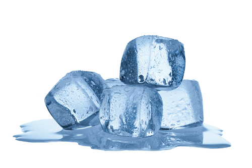
Blue is the color of water or ice, and it has a calming effect on our minds.
On the opposite end of the spectrum, we have warm colors like red, yellow, and orange.
Even though turquoise doesn’t fit into these parameters, it’s helpful to see how these two styles react to each other.
This will help you figure out how to utilize turquoise effectively in your next project.
Complementary Colors
When looking at all of the different shades, they are usually put onto a wheel. This makes it much easier to determine which ones are considered analogous and which are complementary.
For the latter classification, both hues have to sit on opposite sides of the wheel.
A perfect example of this is yellow and blue. When you combine these two colors, they enhance each other and make each other more vibrant and exciting.
Since turquoise is on the cool side of things, a complementary color would also be yellow, although perhaps a deeper, more golden shade would be a better example.
Analogous colors are those that sit together on the color wheel. In this case, turquoise will blend well with blues and greens.
This is also helpful to understand because those colors are vital to the creation of turquoise itself.
Turquoise in Design
If you are planning on implementing this shade into your graphic or interior designs, it’s critical that you understand the effect that it has on your audience.
Drawing from color theory, we know that turquoise is a cool color. As such, it will have a tranquil effect, but there is more to it than that.
We want to dive into the fundamental psychology of color so that we can employ it even more dynamically.
Since the goal of great design is to elicit a reaction, knowing as much about the psychology of turquoise will provide much better insight.
What Turquoise Means
Beyond the generic emotions of calm, this color also connotes things like openness and clarity.
Seeing turquoise inspires you to be more communicative with others, and it spurs honesty in your interactions.
Turquoise is not a duplicitous color; it is one that has authority and integrity.
Balance is another aspect of this color that can create some vivid and exciting imagery. When you’re feeling anxious or overwhelmed, you can look at a rendering of turquoise and feel more at peace, more centered.
As you can imagine, knowing the psychological impacts that turquoise can have is a powerful tool in your designs.
You can alter someone’s thinking and mood just by adding turquoise to the finished piece.
An Appealing Shade
Turquoise is one of those rare colors that appeal to almost everyone. Depending on how you mix it, you can make it a little more masculine or somewhat more feminine.
However, regardless of how dark or bright it is, turquoise crosses barriers and speaks to everyone on a deeper level.
This is another reason why this hue is so powerful in design. When it’s the focal point, it can add sophistication to your piece.
If it’s used to enhance other colors, then its psychological effects can transfer to them, which will make the whole combination more aesthetically pleasing.
Origins
Sometimes, it’s helpful to understand the history of a particular color so that you can better implement it in your design strategy.
In this case, turquoise translates to “Turkish stone.” The reason for this is that the color originated in Turkey and quickly spread to the Western world in Europe.
For centuries, turquoise has been used as a means of displaying wealth and prosperity. Rich people across time periods have worn turquoise jewelry to show off their style and sophistication, which is another reason why the color is so appealing.
These days, most turquoise items are crafted in the US or Mexico, but the historical connotations are still there.
Unlike other colors, turquoise is always seen as “exotic” and lively, which can help add some mystery and intrigue to your designs.
How to Make Turquoise
Now that we know what to expect from using this shade, we want to know how to make turquoise. What two colors make turquoise?
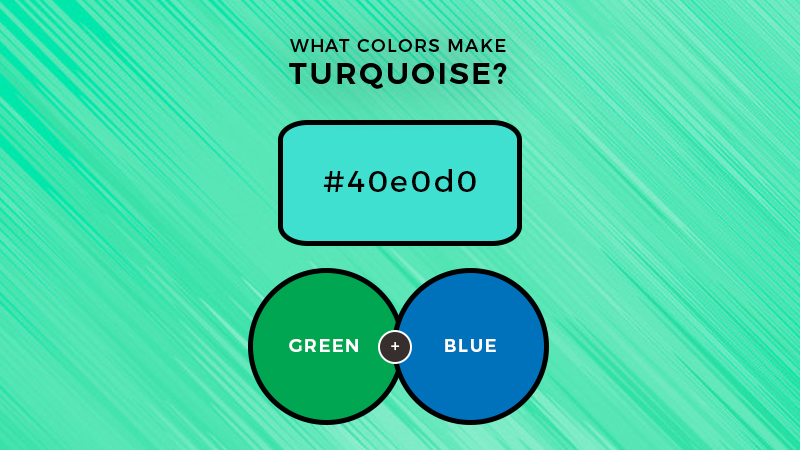
For the most part, it’s a mixture of green and blue. However, there are a few different techniques that you can use to enhance its vibrancy and aesthetic.
Basic Turquoise
If you are just trying to master the color on its own, then here’s how you make it. Although it is a mixture of green and blue, the shade leans more on the blue side.
As such, your starting ratio should be about two parts blue to one part green. This will ensure that the results are even and uniform.
Creating a Brighter Shade
Since green is made by mixing blue and yellow, that means that you can incorporate yellow into your turquoise to make it brighter and more dynamic.
White can also be added to soften the effect and add a bit more class to the color as a whole.
When you have your base hue (two parts blue to one part green), then start adding a little bit of yellow and white and see how it affects the results.
Darker Turquoise
At first glance, you may think that adding black is the best way to get a darker shade. However, black is so intense that it can sometimes desaturate the color overall, which can create a fundamentally different result than you may want.
Instead, use a deep blue (like navy) or a little bit of purple to add some depth and character to your turquoise.
This will darken the shade without desaturating it, and it will create a much more vibrant and exciting hue.
In the end, be sure to experiment as much as possible. The variations of turquoise can be fun and lively, and they can add a lot more style to your project.
On the lighter end, you can create hues like sea-foam green.
Conversely, aquamarine is another variation of turquoise that has a lot of character and personality.
What Colors Go With Turquoise?
As we mentioned earlier, part of color theory is knowing how different shades interact with each other.
As such, we want to look at the various ways that you can combine turquoise with other colors to make them pop. Here are a few examples.
Warm Colors
If your shade of turquoise is on the lighter side, then it will pair well with any and all warmer colors.
They will kind of blend into each other, which can create a more harmonious appearance to your project.
On the flip side, you can also use a darker version of turquoise to enhance both colors individually.
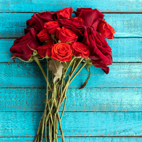
For example, a deep turquoise border around a bright red center will make the whole thing pop out and grab your audience.
Cool Colors
Since blue and green are already elements of the color, you can combine them effectively in many different designs.
This is helpful if your goal is to create an analogous color scheme. Pairing turquoise with different shades of blue, purple, and green will create a harmonious effect and develop much more of an impact on your audience.
When combining analogous colors like this, it’s imperative that you use a variety of tones and shades to prevent everything from blending together too much.
A good rule to follow is that brighter colors come out of the frame, while darker hues recede. This will enable you to maximize your effects.
Neutral Colors
Lighter shades of turquoise pair excellently with neutral tones like gray, white, and black.
Some versions of brown and tan are also great to use with turquoise, as they can create the image of a beach where the water meets the sand.
Again, remember to pair different shades together to get a more dynamic effect. For example, if you have a dark gray centerpiece, a light turquoise border will make it pop, and vice versa.
Bottom Line
Now that you know what colors make turquoise and how to utilize it in your designs, we hope that you will be inspired to create some incredible artwork.
So when someone asks how to make turquoise… you can simply tell them that they can mix blue and green in different variations.

Read Latest Posts


Hi, I'm Anthony Tran! Welcome to my site. I live in Arizona and am obsessed with all things related to building an Online Business and working from home. Learn about my journey here.
Follow Online