What Color Is the Opposite of Pink?
Have you asked yourself, “What color is the opposite of pink?” Pink is a lighter tint of red because of the added white color. Because of its soft shade, pink is mostly associated with women and femininity.
Let’s find out what color complements pink in the color wheel. Keep reading for a review of color theory and how colors affect each other.
Color Combinations
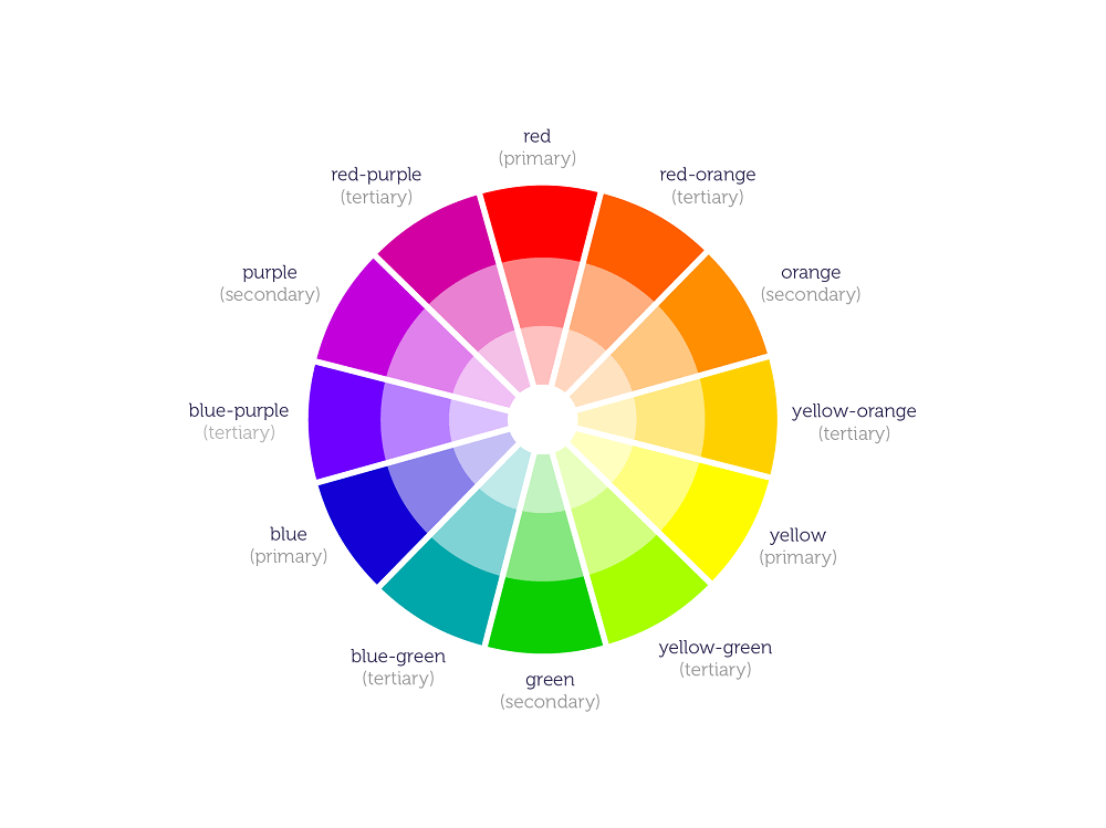
Colors affect one another. As an artist, you can understand this concept by simply mixing two colors together. The reason why there are secondary and tertiary colors is because of these color combinations.
For instance, green is acquired when you mix blue and yellow together. The lightness of yellow influences blue, which is a darker color.
Now, imagine how yellow also makes red lighter and produces orange. These formed hues are products of color mixing, which is a common technique used by artists when painting or making any artwork.
Nowadays, while there are more colors available on the market, some artists resort to buying essential colors, then experimenting to form new colors. By adding more quantities of another color, they can create a custom shade they desire for their artwork.
The basic technique in color combination is finding harmony between two colors. ‘Complementary’ is the term used to describe two opposite colors on the color wheel. The high contrast between two complementary hues leads to a vibrant look. Complementary colors are great for many things, but not for text.
Another common color combination technique is finding analogous colors or those that sit next to each other on the color wheel.
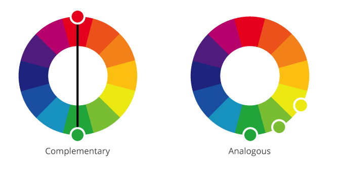
Analogous color schemes match hues; creating serenity and comfortable designs. The first color is highlighted but the second color is used as support to create a contrast. Example of analogous colors includes blue, green, and light green.
Triad, on the other hand, is a color scheme that uses paler or unsaturated versions of the color. In this technique, the colors are carefully balanced to let one color dominate and use the other two for accents.
Opposite of Pink
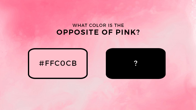
If you look closely at the color wheel, you can see that the opposite of pink is green. This is because the opposite of red is green. Since this color is a shade of red, the complementary color of pink is green.
When you place pink alongside the green, you can see that the color de-saturates pink. The two make each other stand out in a painting or design.
One way to test if colors are opposites is by mixing them together. If you use acrylic paint and combine pink and green, the end product will look a weird brown.
This color is somewhat similar to the color of the algae, like that seen in a pond. Because pink and green are contrasting, the result will tell you that parent colors have been canceled.
Even if you add a small quantity of green to pink and vice versa, the result will still tell you that they cancel one another out.
Pink Color Combinations
If you are hoping to find the best color combinations with pink, the colors to use are:
- White
- Gray
- Aqua
- Blue-green
- Pastel yellow
- Purple
These colors enhance the overall aesthetics when added alongside pink. This is especially true for interior design, digital art, and painting. For interior design, you can always complement pink by adding a less stand-out color like white, gray, or pastel yellow.
The intense lightness of pink simply makes it more interesting.
Pink and purple are very similar colors, though pink is lighter. When you use the two for design, the contrast is easy on the eyes. Pink acts as an accent to purple, which in turn, makes the combination appealing.
Neutral colors like white and gray are the safest colors to use alongside pink. These two act as accents to enhance pink and make it stand out.
Psychology of the Color Pink
In color psychology, pink represents love, nurturing, affection, and kindness. The color speaks to the personality of those who love pink. Studies have even revealed that when exposed to pink, people experience a calming effect on their nerves. Violent or aggressive individuals calm down when they are placed inside a pink room for a specific amount of time.
Additionally, pink is also an inspiring color and represents unconditional love. It is a non-threatening color that speaks of acceptance, support, and tender care.
Bottom Line
Pink is a nice color that represents purity, kindness, and affection. The opposite color to pink is green, which is proven to cancel out the color.
Hope you can use this lesson for your next artwork.

Read Latest Posts


Hi, I'm Anthony Tran! Welcome to my site. I live in Arizona and am obsessed with all things related to building an Online Business and working from home. Learn about my journey here.
Follow Online