Red and Yellow Mixed! What Color Does Red and Yellow Make?
In this article, we will talk about what happens when you mix the colors red and yellow together. We will also share some insight into how color theory works to help you understand the science behind it all.
Keep reading…
Color mixing is fun and exciting, especially when it allows you to experiment with a variety of tones and shades. More importantly, it gives you the freedom to explore boundaries.
Whether it’s fashion, painting and the arts, beauty, and makeup, or even interior design and architecture, there’s no denying that learning how to combine colors comes in handy.
Before going crazy and heading off in different color-mixing directions, it is always best to start small and know your basics. After all, this allows you to get a good, firm grasp on the foundation. What better way to do so than by getting to know red and yellow?
Both of these warm colors remain a crowd favorite primarily because of their versatility and of course, the coziness and depth they can lend to just about any space.

Red reminds most people about fire, passion, and even desire. Now that Valentine’s Day is just a few weeks away, it also calls to mind the burning love between two individuals or even for another group or organization.
Red is also akin to energy.
On the other hand, what comes to mind when you hear the word yellow are sunshine and happiness. It also evokes a sense of hope and positivity for a much brighter tomorrow.
Individually, these two colors are seen as bold choices. However, you may wonder about the combination of the two.
Read on to find out…
Color Theory and the Relationships of Colors
Whether you are an art student, a makeup artist, or simply an avid art enthusiast, having a firm command of color theory and the relationships of color is essential.
In a nutshell, color theory is the process of combining colors within the color wheel. The color wheel shows not only which colors lie close to one another but which hues complement each other as well.
In other words, the color wheel is responsible for showing the relationship of hues to one another.
The Color Wheel
One of the most effective ways to illustrate the relationship of tones to one another is through the color wheel. In elementary school, we learned that the color wheel is comprised of three categories that are arranged in a chromatic manner.
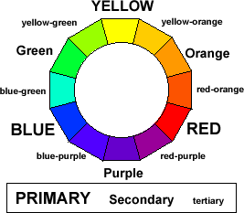
The primary colors, namely blue, red, and yellow, are placed equidistantly from one another. Meanwhile, secondary colors, including violet, green, and orange, as well as tertiary hues such as blue-violet, red-violet, red-orange, yellow-green, yellow-orange, and blue-green, can all be found between the primary colors.
This depicts the colors that bear the same or similar hues and those that complement one another.
What Color Do Red and Yellow Make?
By now, you should have an idea of what red and yellow make when combined. If you refer to our discussion above about the color wheel and color theory, you might have noticed that secondary colors are the result of two primary colors mixed together.
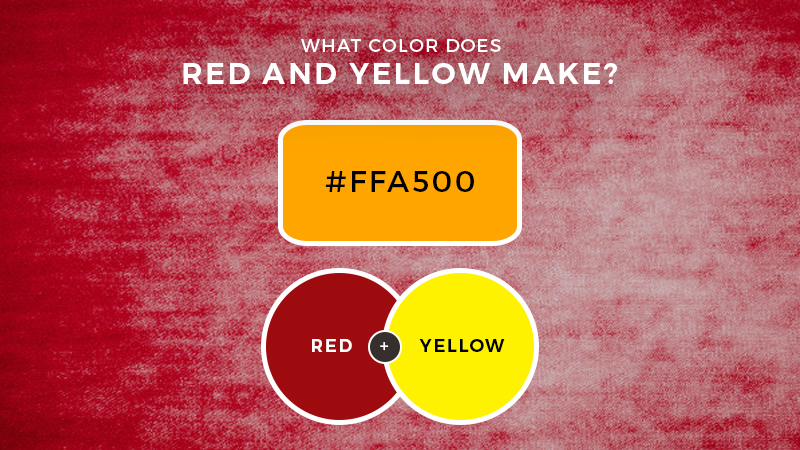
Red and yellow are basic colors. When combined, they result in bright and beautiful orange.
Orange falls right in the secondary color category. If you manage to get hold of a color wheel, you can even see that orange sits right in between red and yellow.
Bear in mind that equal parts red and yellow will make orange. However, if you want to get a darker hue, you can simply add more amounts of red. In the event you wish to obtain a lighter shade of orange, you can start with 2 parts yellow and 1 part red and take it from there.
Orange in Design
Falling in the warm-toned category, orange also retains the sense of coziness and vibrancy that is exuded by those in the same spectrum.
In many ways, it speaks of youthfulness and fun – almost as if getting the best from red and yellow. It provides any space or design with the excitement that comes from red, while still retaining the sense of a warm and welcoming atmosphere from yellow.
In design and architecture, orange is often used for accenting walls and highlighting a particular area. It brings depth and dimension, as well as the ability to set the tone and mood of a space.
This can work best against white and even darker tones such as royal blue and navy.
In marketing, orange is considered a bold move. It bears a lot of impact and screams powerfully while being earthy all at the same time. Just take a look at A&W’s or Penguin’s logo.

In terms of fashion, orange is seen as a versatile choice. While undoubtedly used for warmer weather such as spring and summer, orange can be transitioned to an autumn color as well by opting for more muted hues.
Orange derivatives of peach, salmon, and terracotta play well with just about all the neutral tones in your closet.
The Bottom Line
From this discussion, one can say that orange really is the new black. Now that you know what red and yellow make, it’s time to get out of your comfort zone and begin experimenting with the endless possibilities this outcome can provide.

Read Latest Posts


Hi, I'm Anthony Tran! Welcome to my site. I live in Arizona and am obsessed with all things related to building an Online Business and working from home. Learn about my journey here.
Follow Online