What Are Complementary Colors to Pink?
Have you ever wondered what goes perfectly with the color pink?
Are you planning to redecorate your home or maybe create a new art project? If you are thinking of using pink as your main hue, you need to experiment with color combinations. This will help you come up with a beautiful result that will instantly improve your work.
In this article, we are going to dive deeper into the color pink and which specific colors complement it best.
Keep reading…
Pink is a surprisingly flexible color that works nicely with most other colors. It adds a touch of fun to a room filled with neutral colors. For instance, in interior design, the color pink stands out when placed side by side with other colors, such as black or white.
To see how pink complements other colors, you can use crayons or paint. Now, let us also not forget that there are colors that cancel out pink and produce neutral colors gray or black.
Let’s get started…
What Colors Make Pink
First off, you have to understand how pink is created. Pink is within the family of the color red, which is a primary and warm color.
When you add white to red, the byproduct will be pink. Now, there are many variations of pink, depending on the amount of red or white added.
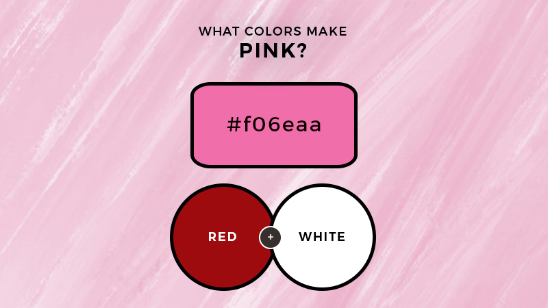
Light pink is more subtle. It is made by adding more white to red.
Meanwhile, if you put more red into your mix, the end result will be hot pink, magenta or ruby.
Color Combinations
Within the world of color, you can create different combinations or color schemes—these are commonly used in the design and a range of other media.
Colors that go well with each other form a color scheme to achieve coordination, balance, and harmony.
This is why there are colored families and why you need to know about them. For designers, mixing and matching colors is the backbone of the design.
The interaction of the colors, when combined, is important to portray a certain reaction or emotion.
In interior design, you use a particular shade of color to match the owner’s character and personality.
Remember, colors also portray emotions, and using the wrong shades, from the wrong choice of furniture to finish, can affect everything.
Designers also need to understand the effect of color combinations as these influence the overall branding and look of their projects.
This is why color theory is considered an art and science in itself because one cannot simply combine random colors.
For pink, there are a variety of combinations to try to evoke different feelings:
- Sophisticated: Dusty Pink and Burgundy
- Vintage: Bubblegum Pink and Hot Red
- Earthy: Light Pink and Subtle Gray
- Statement: Blush Pink and Black
- Playful: Salmon Pink & Teal
- Girly: Pink and Orange
- Warm: Pink and Mint
As you can see, pink can go well with almost any color, except for some contradictory hues. For example, pink can look awkward with very dark green and also bright yellow. Navy blue is also not commonly used with pink.
Complementary Colors to Pink
https://youtu.be/4qPwmiPo7h4
Although complementary colors will make each other stand out when used side by side, they will cancel each other out when mixed together.
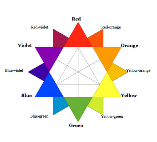
First, you need to know that a complementary color is one found exactly opposite on the color wheel.
The opposite of pink is green.
If you combine both, the mixture will be gray. Pink and green cancel out each other, forming a pale gray.
This is integral knowledge for artists because if you accidentally mix the two when painting, gray will be formed. Using acrylic paint, for instance, can be very tricky.
If you are painting leaves and pink roses, and accidentally mixed the two, the byproduct can ruin the artwork. Another complementary color to pink is mint.
If you mix the two, the end result will be dark gray.
Psychology of Color Pink
According to Empowered By Color, pink means unconditional love and nurturing quality. The color relates to the feeling of being in love, purity, and openness.
Because white is added to the primary color red, it softens the passionate love implied by red.

Brands often use pink to depict women, babies, or romance. The energy of pink dictates passion, which came from red, and intimacy.
The gentle loving energy of this color makes it a good choice for women. However, boys can also choose pink to represent empathy and sensitivity.
Bottom Line
Although pink can look amazing with other colors, it can also cancel out green, resulting in gray. This is called a complementary color—one which creates neutral colors when combined.
Hope you enjoyed today’s lesson and use this knowledge for your next project.
Cheers!

Read Latest Posts


Hi, I'm Anthony Tran! Welcome to my site. I live in Arizona and am obsessed with all things related to building an Online Business and working from home. Learn about my journey here.
Follow Online