Aqua Color Meaning: What is the Meaning of the Color Aqua?
Are you wondering what the meaning of the color aqua is? Stick around as we share some interesting information about this color and what it means.
Aqua is the color of the ocean, that’s why in Latin, the meaning of this word is water. In the same way, if you think of this color, you can probably picture the azure-blue ocean or the clear skyline.
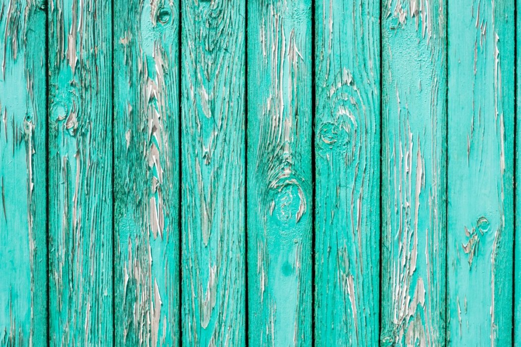
The color that you see, Aqua, is a hue somewhere between blue and green. It is named for the color of the water, representing a strong, intense green color, with hints of blue and the absence of red.
Aqua, at first glance, may look like blue-green, but these are two different colors with distinct qualities.
Are you trying to paint using aqua acrylic paint? Keep reading to learn the best colors to combine with aqua and what colors you can use to make this hue.
Properties of Aqua Color
In the RGB color model, aqua leans more towards blue and green, without the primary color red. This is because of the properties of light and water present in the color.
When light travels through water, red wavelengths are absorbed, and blue and green escape the absorption. With this, deep water appears blue or blue-green.
If you examine bodies of water, some may look clearer than others. Factors such as light, depth, and mineral content make the color of water different.
In the RGB color model, aqua has a code of #00FFFF; 0/256 red, 255/256 green, and 255/256 blue. There are different shades of aqua, including cyan, aqua foam, aqua forest, aqua frost, aqua lake, aqua Obscura, and aquamarine.
Even though they have almost the same tone, they are still completely different from one another.
For instance, cyan is a darker version of aqua. The hues may be similar, but when you compare the two, aqua appears lighter because of the intense blue color.
Aqua foam leans toward green and gray, making the color a somewhat bland green. Furthermore, aquamarine is a light green color, with little blue tints in it.
Probably the closest color to aqua is turquoise. It is a combination of blue and green, but what you need to mix is a pale blue, meaning, it has to have a more white base to it.
Turquoise is also associated with bodies of water, because of its bright blue-green appearance. However, if you look closely, aqua is still lighter compared to turquoise.
What Colors Make Aqua
By now, you probably know what colors make aqua. Aside from blue, you need to have yellow and white to come up with the light blue-green appearance of this color.
You need to use yellow, instead of green, because when you mix blue and yellow, you will get green. Adding white to the mixture just makes the color lighter.
Note that putting too much yellow into the mixture can create a different shade of aqua. It is important to mix a smaller quantity first, then add as you go to get your desired shade. Another color mixture to get aqua includes combining pale green, blue, and yellow.
In color mixing, what’s important is using enough quantity of each color. For aqua, you don’t need to mix equal quantities of blue, yellow, and white, because yellow can intensify the lightness of aqua. Experiment with your brush and mix evenly, then see if you need to add more of the mentioned colors.
Meaning of Aqua Color
The lightness of the color can mean clarity of thought and calmness. This is the reason why the beach is associated with easing stress and pressure. The turquoise waters and blue sky calm the mind and provide a sense of clarity.
Aqua can mean balance and stability, as well as peace, growth, and energy. If your favorite color is aqua, it represents your inner peace and gentle personality.
Additionally, this color encourages inner healing, enhances empathy, and shows care.
Overall, this color means tranquility and being at peace. The reason why some people paint their child’s room aqua is that it is light, fun, and calming. The color is easy on the eyes and can make anyone feel at ease.
Aqua in Interior Design and Branding
The color of water or aqua is used by a lot of brands, including Skype, Twitter, Windows, and Dell because of the attractiveness of the color. Not to mention the standout quality of aqua, which makes brands dominant.
For interior design, aqua simply makes spaces feel bigger and brighter. With natural light coming in, the color can make a house feel calming and fresh. The best color combinations for aqua are pastel pink, gray, white, gold, and navy.
Conclusion
Aqua is a great color that can be easily paired with other colors. Because of its light appearance, aqua is associated with peace, clarity of thought, and healing.
The next time you use aqua in your art project, you will be able to readily distinguish it from other colors such as turquoise and cyan.
We hope that you can use this knowledge in your art projects.
Cheers!
Read Latest Posts

Hi, I'm Anthony Tran! Welcome to my site. I live in Arizona and am obsessed with all things related to building an Online Business and working from home. Learn about my journey here.
Follow Online


